
A strong brand is not built on isolated design assets but on a consistent, scalable system. The Memorable Design System combines strategy, visual identity, color, typography, imagery, components, and governance to ensure every touchpoint reinforces the same brand. This consistency improves recall, speeds production, and allows brands to grow without losing clarity or cohesion.
Most brands do not fail because of bad design. They fail because of inconsistent design.
A single great logo does not build a brand. A single great color palette does not either. What builds a brand is a connected, consistent, scalable system that works across every surface, every channel, and every stage of growth.
That is exactly what a design system for branding solves. And at memorabledesign.com, it is the foundation of everything we build for high growth brands.
This post breaks down the exact Memorable Design System we use, why each component exists, and how it creates the kind of brand identity that scales without breaking.
What Is a Design System for Branding and Why Does It Matter?
A design system for branding is a structured set of visual and verbal guidelines, components, and rules that govern how a brand looks, feels, and communicates across every touchpoint.
It is not just a style guide. A style guide tells you what colors and fonts to use. A brand identity system tells you how every element connects, why each decision was made, and how to apply the system to situations that did not exist when it was created.
For high growth brands, this distinction is critical.
When a brand is growing fast, new channels appear, new team members join, new markets open up, and new content needs to be created at speed. Without a proper scalable branding design system, every new touchpoint becomes a guessing game. The result is visual drift, the slow erosion of brand consistency that makes a brand look fragmented and unmemorable.
A well-built design system prevents that. It acts as a single source of truth that keeps every expression of the brand aligned, no matter who creates it or where it appears.
The 7 Layers of the Memorable Design System
The system we use at memorabledesign.com is built in seven connected layers. Each layer serves a specific function. Together they create a brand identity that is coherent, flexible, and built to scale.
Layer 1: Brand Foundation
Before any visual decisions are made, the brand foundation needs to be defined. This is the strategic layer that everything else sits on top of.
The brand foundation includes the brand's core purpose, the audience it serves, its positioning in the market, and its personality. These are not marketing exercises. They are design briefs in disguise.
Every visual decision in the system is anchored to the brand foundation. The color palette is not chosen because it looks nice. It is chosen because it communicates something specific about the brand's personality to a specific audience in a specific context.
When the foundation is clear, visual decisions become easier, faster, and more consistent. When the foundation is vague, every visual decision becomes a debate.
Layer 2: Visual Identity Core
The visual identity core is the set of primary elements that form the recognizable face of the brand.
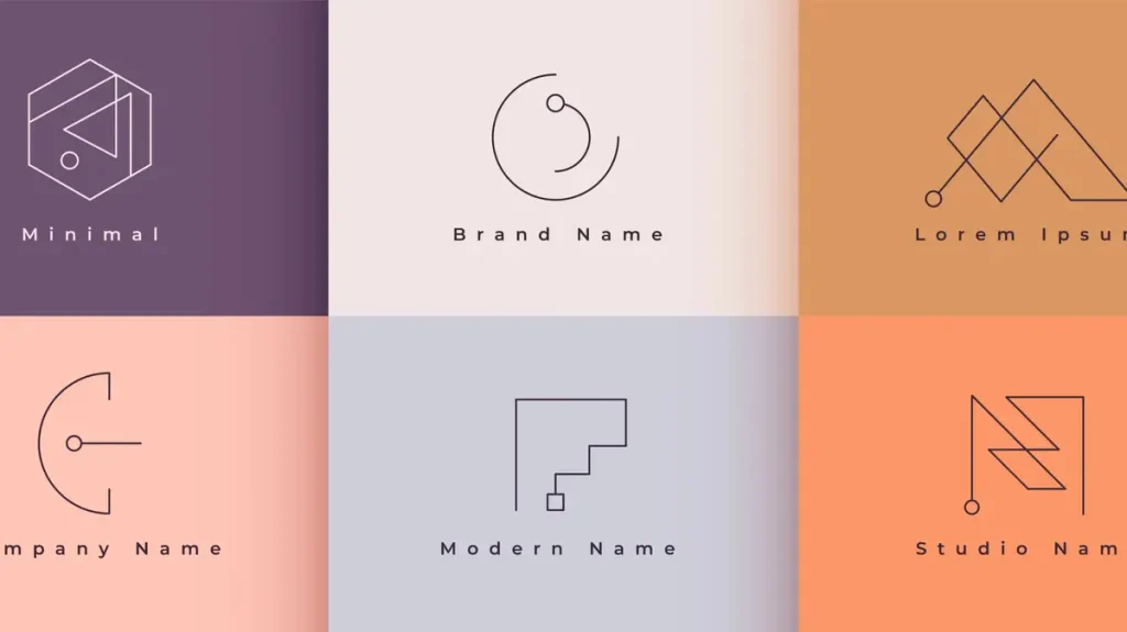
This layer includes the logo system, the primary color palette, the core typography, and the primary graphic element or ownable visual device.
Here is how we structure the visual identity core for the brands we work with:
| Visual Element | Purpose | Common Mistakes |
|---|---|---|
| Logo System | Primary recognition mark across all sizes and contexts | Too complex for small sizes, no clear variations defined |
| Primary Color Palette | Emotional tone and instant brand recognition | Too many colors, inconsistent application across channels |
| Core Typography | Voice, personality, and hierarchy in written communication | Too many typefaces, poor legibility at small sizes |
| Ownable Graphic Device | The single visual element the brand can own uniquely | Generic shapes, not differentiated from category competitors |
| Brand Iconography | Supporting visual language for UI, content, and navigation | Inconsistent style, mixed from multiple icon libraries |
Each element in the visual identity core must earn its place. If it does not contribute directly to recall or communication clarity, it does not belong in the core.
Layer 3: Color Architecture
Most brand guides list a set of brand colors. The Memorable Design System goes further by defining a full color architecture that governs how colors relate to each other and how they are used in different contexts.
Color architecture includes a primary color, which is the dominant brand color used for the most important elements. It includes secondary colors used for supporting elements and content variety. It includes functional colors for system states like success, warning, and error in digital products. And it includes neutral colors for backgrounds, text, and structural elements.
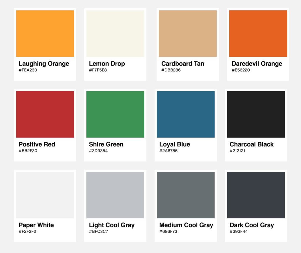
The architecture also defines usage ratios. For example, the primary color might be used at 60 percent, secondary at 30 percent, and accent colors at 10 percent. This ratio is what maintains visual harmony across complex brand environments.
Without color architecture, brands end up with palettes that look cohesive in a presentation and chaotic in practice.
Layer 4: Typography System
Typography is one of the most underinvested parts of a brand identity system, and one of the most powerful.
The way a brand uses type communicates personality before the reader processes a single word. A serif typeface in a luxury brand communicates heritage and authority. A geometric sans-serif communicates modernity and precision. A humanist typeface communicates warmth and approachability.
The Memorable Design System defines typography at three levels.
The first is brand typefaces, the primary and secondary fonts that are owned by the brand and used consistently everywhere. The second is a type hierarchy, a clear set of rules for how headings, subheadings, body text, captions, and labels are sized, weighted, and spaced. The third is type behavior rules, which govern how typography adapts across different contexts such as print, digital, mobile, and outdoor.
A well-defined typography system means any piece of brand content, created by anyone on the team, looks like it came from the same brand.
Layer 5: Imagery and Visual Language
One of the most commonly overlooked components of a scalable branding design system is a defined imagery style.
Imagery includes photography, illustration, iconography, and any other visual content used to communicate the brand's world. When imagery style is undefined, different team members pull from different sources, apply different editing styles, and create content that feels visually disconnected from the rest of the brand.
The Memorable Design System defines imagery across four dimensions.
Subject matter covers what kind of scenes, people, and environments represent the brand. Composition style covers whether imagery tends toward tight crops, wide scenes, centered subjects, or dynamic angles. Color treatment covers whether photos are used naturally, with a warm grade, a cool grade, or a specific branded filter. Mood covers the emotional quality the imagery should consistently communicate.
When imagery style is defined clearly, the brand's visual world feels consistent even when the content itself varies widely.
Layer 6: Component Library
This layer is where the brand identity system becomes a practical production tool.
The component library is a collection of pre-built, pre-approved design elements that can be assembled to create brand communications quickly and consistently. It includes things like social media post templates, presentation slide layouts, document and report formats, email header designs, advertising templates, and digital UI components.
The component library does two things simultaneously. It speeds up content production by giving teams ready-made building blocks. And it enforces consistency by ensuring those building blocks are already aligned with the brand system.
For high growth brands that need to produce large volumes of content across multiple channels, the component library is not a luxury. It is a necessity.
Layer 7: Brand Governance Guidelines
The final layer of the Memorable Design System is the one that keeps everything else working over time.
Brand governance guidelines define who has the authority to make visual decisions, what the approval process looks like for new brand applications, how the system should be updated as the brand evolves, and what constitutes a brand violation versus an acceptable adaptation.
Without governance, even the best-designed system degrades. New team members make assumptions. Agencies interpret guidelines loosely. Temporary exceptions become permanent habits. Governance prevents this by making the rules of the system explicit and the process for exceptions clear.
How the System Scales With Brand Growth
One of the most important qualities of a design system for branding is that it must be able to scale without breaking.
Here is how the Memorable Design System handles the most common scaling challenges:
| Growth Scenario | Challenge | How the System Handles It |
|---|---|---|
| New team members joining | Inconsistent application of brand guidelines | Onboarding documentation and component library give instant clarity |
| Entering a new market | Visual identity may need cultural adaptation | Color and imagery guidelines include adaptation rules for regional use |
| Launching a new product line | Sub-brand needs its own identity within the master brand | Brand architecture layer defines relationship between parent and sub-brands |
| Expanding to new channels | Each channel has different format and context requirements | Component library includes channel-specific templates built to spec |
| Working with external agencies | Agencies interpret guidelines differently | Governance guidelines define exactly what is and is not permitted |
| Rapid content production needs | Speed creates inconsistency | Pre-built templates allow fast production without sacrificing consistency |
The system is designed to answer questions before they are asked. When a new situation arises, the team should be able to look at the system and find clear guidance rather than starting a debate from scratch.
Why Most Brand Guides Are Not Design Systems
There is an important distinction worth making clearly. A brand guide is documentation. A brand identity system is infrastructure.
Most companies have brand guides. They are PDFs that show the logo, list the colors, and display the fonts. They are created once, shared once, and then quietly ignored as the business grows and new needs emerge that the guide never anticipated.
A proper scalable branding design system is living infrastructure. It is accessible to everyone who needs it, updated as the brand evolves, and connected to the actual tools teams use to produce brand content.
The difference in outcome is significant. Brands that operate from a living system maintain visual consistency as they scale. Brands that operate from a static PDF drift toward fragmentation. That fragmentation directly damages brand recall, which damages brand equity over time.
The Results a Strong Design System Produces
When a brand identity system is built correctly and applied consistently, the results are measurable and predictable.
Brand recognition improves because the same visual elements appear repeatedly across every touchpoint, training audiences to associate those elements with the brand automatically.
Content production gets faster because teams are working from pre-built components rather than designing from scratch every time. This reduces both time and the potential for inconsistency.
Brand equity increases because a consistent, distinctive, memorable brand commands stronger preference and loyalty among its audience over time.
New channel expansion becomes straightforward because the system already contains rules for how the brand adapts to new contexts without losing its identity.
And perhaps most importantly for high growth brands, the brand does not need to be rebuilt every few years. A well-architected system can evolve and expand without requiring a complete rebrand, which saves significant time and budget as the company grow
Conclusion: A System Is What Separates Brands That Scale From Brands That Fragment
The difference between a brand that grows stronger over time and one that becomes visually inconsistent and forgettable is almost always a design system.
A design system for branding is not a creative limitation. It is a creative framework that makes every expression of the brand more powerful by ensuring it reinforces the same memory, the same feeling, and the same identity every time.
The Memorable Design System is built around one central belief: great branding is not what you create once. It is what you repeat consistently.
If your brand is growing and your visual identity is struggling to keep up, the answer is not more design. It is better design infrastructure.
That is what a scalable branding design system provides. And it is what every high growth brand eventually discovers it cannot do without.
For more on building brand identity systems that scale, visit memorabledesign.com.
Frequently Asked Questions (FAQs)
Q1: What is a design system for branding?
A design system for branding is a structured set of visual rules, guidelines, and reusable components that governs how a brand looks and communicates consistently across every channel and touchpoint.
Q2: How is a design system different from a brand style guide?
A style guide documents visual elements like colors and fonts. A design system goes further by defining how every element connects, how the system scales, and how it governs brand decisions across the entire organization.
Q3: Why do high growth brands need a scalable branding design system?
As brands grow, more people create brand content across more channels. Without a scalable system, visual inconsistency builds up over time, which weakens brand recognition and recall.
Q4: What should a brand identity system include?
A complete brand identity system should include a visual identity core, color architecture, typography system, imagery guidelines, a component library, and governance rules for how the system is managed and updated.
Q5: How does a design system improve brand recall?
By ensuring the same visual elements are applied consistently across every touchpoint, a design system creates the repeated exposure that builds strong brand memory in the audience over time.


0 Comments