
The 16 empty state designs from top B2B products show that a zero-data screen is a critical onboarding asset. Top SaaS companies like Slack, HubSpot, and Stripe use these screens to combat trial churn by replacing blank pages with clear status explanations, visual inspiration, and frictionless calls-to-action. Memorable Design emphasizes that converting empty space into an educational tool builds user confidence and boosts long-term retention.
Imagine spending months perfecting your marketing campaigns, driving a flood of targeted B2B users to your SaaS platform, only for them to log in and face a blank white screen. This cold shoulder is what happens when software teams neglect their zero-data screens. To build a truly modern user experience, studying 16 Empty State Designs From Top B2B Products (And What They Teach) reveals exactly how world-class software turns empty dashboards into conversion assets. An intentional, helpful zero-data screen guides confused newcomers, decreases day-one churn rates, and showcases real product value before a user even uploads their first data file.
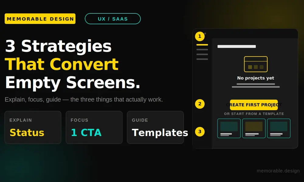
To optimize your user experience, the best 16 Empty State Designs From Top B2B Products (And What They Teach) demonstrate that you must combine a clear status explanation, an inspiring visual cue, and a single, frictionless call-to-action button. Providing these three specific elements bridges the gap between initial curiosity and active feature adoption.
At Memorable Design, we focus on transforming complex digital touchpoints into intuitive customer journeys. Using strategic empty state design examples across your user interface keeps your customers highly engaged from the moment they create an account. Let us dissect how the top business platforms maximize their digital real estate to turn passive sign-ups into power users.
Why the Zero-Data State is Your Most Critical UX Screen
Based on available data from industry-leading product analytics firms, an estimated forty to sixty percent of users who sign up for a B2B SaaS trial will open the app exactly once and never return. This massive drop-off usually happens during the initial onboarding phase when a user encounters a confusing, empty interface. Without data populating the graphs, the platform looks broken, cold, or too complicated to figure out on a busy workday afternoon.
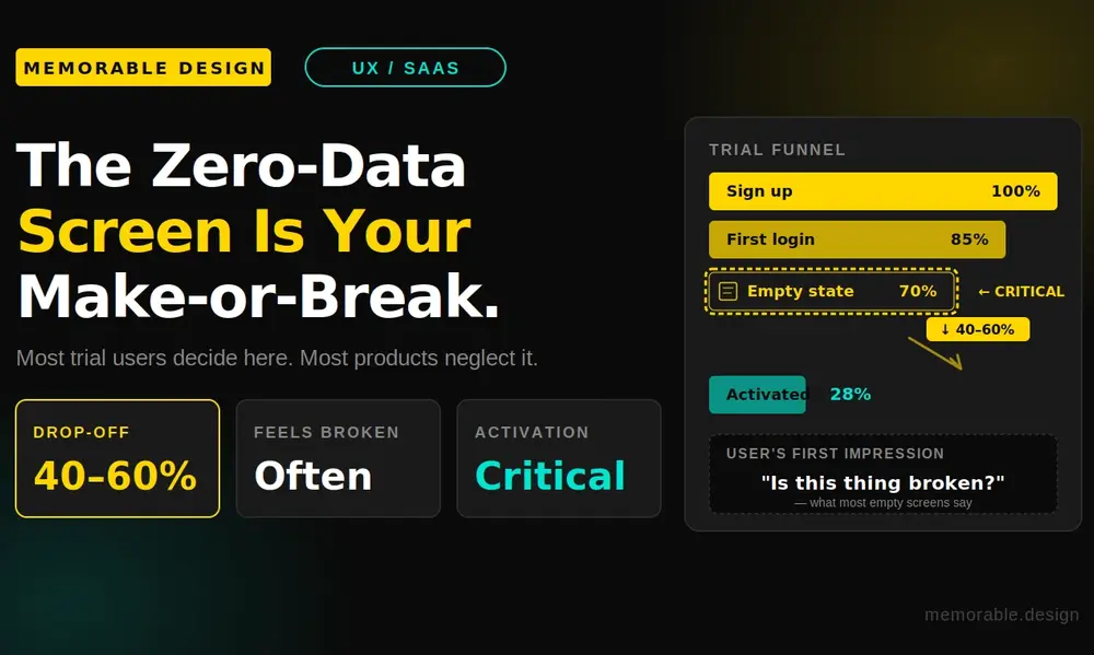
When you invest time into building thoughtful empty state design examples, you directly address this retention problem. These screens are not placeholders; they are your product's handshake. A premium zero-data interface manages psychological friction by telling the user exactly what to do next, transforming an intimidating software tool into an approachable assistant.
A strategic layout acts as an educational map for your user base. It normalizes the setup phase, sets professional expectations, and rewards early interaction. Instead of leaving users wondering where their data went, top enterprise products use this unique space to highlight core value propositions, build immediate brand authority, and accelerate the critical time-to-value metric.
16 Empty State Designs From Top B2B Products (And What They Teach)
The absolute best way to master user interface psychology is to study real-world execution. Let us look at how sixteen massive B2B platforms handle empty dashboards to keep their customers moving forward.
1. Slack (Channels Screen)
When you join a brand-new Slack channel, you are not greeted by an empty chat log. Instead, Slack populates the space with a friendly icon and a direct prompt to invite teammates or send a welcoming first message. They teach us that human connection should always be the primary focus of a communication tool.
2. Trello (Empty Boards)
Trello handles empty project boards by inserting pre-made template options directly into the empty layout. Rather than forcing you to build a project management workflow from scratch, they give you instant inspiration. This teaches product designers to eliminate user analysis paralysis by offering actionable starting points.
3. Dropbox (File Repository)
Dropbox uses a clean, minimalist illustration of an open box alongside a large button that reads "Upload Files." There is no confusing technical text or unnecessary secondary menus to distract your eyes. Dropbox demonstrates that when a user needs to complete a basic task, your layout should feature absolute simplicity.
4. HubSpot (Empty CRM Pipeline)
HubSpot utilizes empty state design examples to educate users on the financial value of their sales CRM pipelines. Their zero-data screen features a graphic of a healthy sales funnel along with a button to "Add a Deal." They teach us that reminding users of the ultimate business benefit motivates them to complete tedious data entry tasks.
5. Mailchimp (Audience Lists)
Mailchimp uses its iconic corporate mascot alongside whimsical copywriting to soften the intimidation factor of launching a marketing newsletter. The clear call-to-action guides you to import your contact lists immediately. Mailchimp proves that brand personality can turn a boring technical setup into an enjoyable experience.
6. Notion (Blank Workspace)
Notion tackles empty workspaces by providing inline placeholder text that tells you to type a forward slash for commands. The screen is incredibly clean but remains highly interactive. Notion teaches us that your interface can serve as a live, real-time training ground for complex software shortcuts.
7. Airtable (Base Creation)
Airtable uses bright, inviting color blocks inside its empty states to show users exactly how a completed database will eventually look. They combine this visual projection with direct paths to import CSV sheets or Excel documents. They teach us to show the final destination to make the initial configuration work feel worthwhile.
8. Asana (Task Management)
Asana keeps its empty task lists incredibly light and encouraging, often using clean line art illustrations of mythical creatures or calm skies. When a list is clear, the microcopy celebrates your organization skills. Asana teaches us that positive psychological reinforcement can turn a basic utility tool into a delightful daily routine.
9. Figma (Design Drafts)
Figma displays grid containers shaped like blank canvas layouts on its dashboard, showing you exactly where your future website wireframes will live. They place a prominent plus sign inside those grids to trigger a new file creation instantly. Figma teaches us to use recognizable physical shapes to ground digital concepts.
10. Zoom (Recorded Meetings)
Zoom fills its empty cloud recordings screen with an explicit explanation of how to start and record a live session. They do not assume you already know how the recording mechanism works behind the scenes. This teaches us to use empty spaces to solve potential technical support tickets before they ever get submitted.
11. Stripe (Payment Logs)
Stripe features a dummy toggle switch that lets developers populate the entire dashboard with simulated transaction data. Seeing mock revenue lines and charts help engineers test integration mechanics without moving real money. Stripe proves that interactive testing features build incredible trust with developer audiences.
12. Intercom (Customer Segments)
Intercom uses a conversational wizard layout within its empty segmentation screens to help users filter customer databases step-by-step. The design breaks a complex query down into small, digestible options. Intercom teaches us that when user actions require high effort, the interface must hold their hand through the logic.
13. GitHub (Repository Setup)
GitHub provides a code snippet terminal block directly inside a newly created repository page, giving engineers the exact terminal commands needed to push their local code files. There is zero fluff or generic marketing speak. GitHub shows us that understanding your user persona's immediate workflow dictates your interface layout.
14. Loom (Video Library)
Loom uses an animated GIF of a person recording a video to show newcomers how fast and simple the recording process is. They pair this animation with a clear extension download link. Loom teaches us that movement and video components inside an empty state can drive tool adoption much faster than static blocks of copy.
15. Buffer (Social Media Queue)
Buffer shows a ghosted visualization of a social media post timeline on its empty queue screen, making it incredibly obvious where future scheduled posts will sit. They place a composer window open by default to invite immediate typing. Buffer teaches us to minimize the physical steps between a user landing on a page and taking action.
16. Canva (Project Folders)
Canva handles empty project spaces by providing highly visual folders that categorize design assets into social graphics, presentations, and print formats. Clicking any empty category reveals hundreds of beautiful, ready-to-use starting assets. Canva teaches us that empty containers should always double as gateways to your best content assets.
Core Strategies for High-Conversion UI States
Analyzing 16 Empty State Designs From Top B2B Products (And What They Teach) reveals a consistent set of underlying strategic principles. To build a premium user interface, your product engineering team should focus heavily on these three core structural elements:
Clear Status Explanation
A premium user interface must explicitly communicate why a dashboard is currently empty. Whether a user has not connected an API, cleared all their data filters, or completed their profile setup, the system needs to state the situation in plain human language. Transparency eliminates initial user confusion and lowers your product's churn risk.
Targeted Call to Action
Never leave an engineering customer hanging without a clear next step after they read your microcopy. Every empty dashboard should feature one single, highly visible action button that solves the problem. Limiting your interface choices prevents cognitive overload and naturally funnel users deeper into your application's ecosystem.
The Core Elements of High-Value B2B Empty States
Building a balanced zero-data screen requires a careful mixture of educational copy, functional code, and encouraging imagery. Use this structural reference table to plan your next design sprint effectively:
| Essential Component | Strategic Purpose | User Psychology Focus | Design Execution Tip |
| Direct Status Copy | Explains exactly why the screen contains no data lines | Eliminates confusion and bugs panic | Keep the message under 2 lines |
| Illustrative Visual | Gives an abstract brand anchor to a blank space | Lowers anxiety and adds brand flavor | Use lightweight, clean vector SVGs |
| Primary Action Button | Directs the user to the single best next onboarding step | Reduces analysis paralysis entirely | Use high-contrast brand colors |
| Secondary Templates | Offers pre-made shortcuts to bypass manual setup work | Lowers the initial user effort barrier | Provide 2 to 3 popular workflows |
Maximizing the Educational Value of Your Interface
When looking closely at 16 Empty State Designs From Top B2B Products (And What They Teach), we notice that top enterprise companies utilize these screens as hidden training manuals. For example, if a dashboard monitors server performance, the empty view should explain how to install the required monitoring scripts.
Furthermore, you can include interactive tooltips that activate when a user hovers over the empty component. This keeps your main dashboard layout remarkably clean while still offering deep technical context for power users who want to dive into advanced settings right away.
Key Mistakes to Avoid in Product Design
Designing effective software screens requires a subtle balance of restraint and helpfulness. Avoiding these common design traps will keep your users engaged and moving forward:
- Do not include multiple competing action buttons: Offering too many choices on a blank dashboard confuses your users and stops them from taking any action at all.
- Avoid dry, robotic error codes: Sentences like "Error: No Data Records Found" make a platform feel cold, broken, and uninviting to a new business trial user.
- Never hide your primary navigation lines: Ensure your global sidebar and main account settings remain fully accessible even when a specific sub-page is empty.
- Do not use heavy, unoptimized image assets: Large PNG images or slow video files inside empty screens can degrade loading performance and frustrate your customers.
Conclusion: Elevate Your Interface with Memorable Design
A beautiful B2B SaaS platform is only as strong as its quietest screens. Taking the time to study 16 Empty State Designs From Top B2B Products (And What They Teach) proves that empty space is actually a massive commercial opportunity to educate your users, showcase your brand values, and drive product adoption.
When you combine clear status explanations, contextual business inspiration, and a single, frictionless action path, you transform a potentially frustrating technical hurdle into a seamless introduction. Every empty dashboard inside your software ecosystem should be treated as an intentional guide that builds user confidence.
At Memorable Design, we understand that great user interfaces balance artistic simplicity with clear business metrics. Take these real-world insights, audit your current software onboarding screens, and design an incredible product experience that turns trial sign-ups into long-term enterprise advocates!
Frequently Asked Questions
What is an empty state design in a B2B SaaS application?
An empty state is the specific user interface screen that appears when a feature or dashboard contains zero data records. This layout occurs during a new user's initial onboarding session, after an account clears out its active tasks, or when a data search query yields zero matching system results.
How do empty state design examples improve user retention rates?
They improve retention by eliminating confusion and providing an immediate, clear path forward. Instead of forcing a new user to stare at a blank, broken-looking screen, a helpful empty state explains how the feature works and provides a direct shortcut to get started.
Should I include marketing videos inside a zero-data dashboard?
Yes, using short, optimized video content can be highly effective for complex tools. A brief, 30-second walkthrough video or an animated GIF inside your empty state can demonstrate feature value much faster than a static paragraph of text, provided it does not slow down page loading times.
How do I design empty states for mobile enterprise apps versus desktop?
Mobile enterprise layouts require extreme visual minimalism and larger touch targets. Because screen real estate is limited on phones, prioritize a single, concise sentence explaining the status and a large, full-width action button, saving complex template libraries and multi-step wizards for the desktop view.
0 Comments