
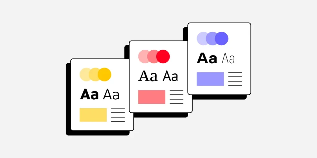
The article explains how a minimalist brand identity focuses on simplicity, clarity, and trust, while maximalist design emphasizes bold visuals and strong personality. In 2026, factors like mobile experience and AI-driven design make this choice more important. Most successful brands combine both styles, using minimal structure with expressive elements to stand out and connect with audiences.
Less is more, until it isn't. That tension sits at the heart of every brand design decision in 2026. A minimalist brand identity strips everything back to what is essential: one hero message, breathing room, and a clear visual hierarchy. Maximalism layers texture, color, and personality until the brand feels impossible to ignore. Neither approach is wrong. But choosing the right one, or the right balance, can be the difference between a brand that builds loyalty and one that gets scrolled past. This post gives you a clear framework for making that call.
What Is Minimalist Brand Identity (And What Is Maximalism)?
Before choosing a direction, it helps to understand what each style actually means in practice, not just aesthetically, but strategically.
Minimalism in Branding
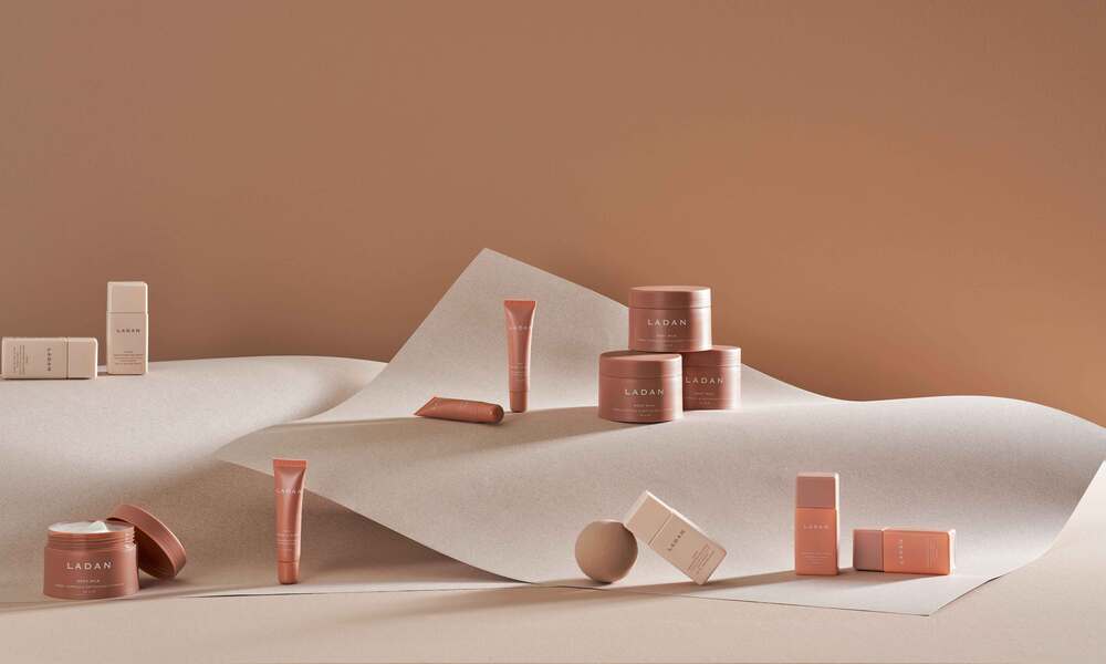
A minimalist brand identity is built on restraint. It uses limited color palettes (often one or two colors), generous whitespace, simple typography, and a clear visual focus. The goal is to remove every element that does not earn its place.
Apple, Google, and Muji are the textbook examples. Their design systems say: we are confident enough not to need decoration.
Minimalism works exceptionally well for mobile user experience. With smaller screens and shorter attention spans, a clean interface reduces cognitive load and guides users to action faster.
Maximalism in Branding
Maximalism is not chaos — it is controlled abundance. It uses layered visuals, bold color combinations, mixed typography, and rich detail to create a sense of energy and cultural richness.
Brands like Versace, Spotify (in campaign mode), and many Gen Z-facing DTC startups lean maximalist. The message is: we have a personality, and we are not hiding it.
Maximalism tends to perform well in fashion, entertainment, food and beverage, and lifestyle categories, spaces where emotional resonance and visual excitement drive purchase decisions.
The 2026 Context: Why This Decision Matters More Than Ever
Design trends do not exist in a vacuum. In 2026, three forces are reshaping how brands must approach this choice.
AI-Driven UI Is Setting a New Baseline
AI-driven UI tools, from Figma AI to Framer AI, are generating design layouts at scale. The result? A flood of competent but generic minimalist interfaces. When everyone's AI generates the same clean grid, minimalism alone no longer differentiates.
This is pushing brands toward more distinctive visual voices. Pure minimalism is no longer automatically premium-feeling — it can just as easily read as generic.
Mobile User Experience Is Non-Negotiable
Estimated 65–70% of global web traffic now comes from mobile devices, based on available data from Statista and similar sources. This single fact has design consequences for both styles.
A maximalist layout that works on a 27-inch monitor can become overwhelming and slow on a 6-inch screen. Meanwhile, a minimalist layout optimized for mobile user experience can feel sparse and underdesigned on desktop.
The answer is not to pick one extreme — it is to design with mobile as the primary canvas and scale up thoughtfully.
Thumb-Friendly Navigation Has Changed Layout Logic
Thumb-friendly navigation — placing key interactive elements within natural thumb reach on a mobile screen, is now a core UX requirement, not a nice-to-have. This affects both minimalist and maximalist brands equally.
Navigation elements placed at the top of a mobile screen are physically difficult to reach for most users. Bottom navigation bars, floating action buttons, and swipe-based interactions are the 2026 standard. Your design philosophy (minimal or maximal) must work within this physical constraint.
How to Choose: A Side-by-Side Comparison
| Factor | Minimalist Brand Identity | Maximalist Brand Identity |
|---|---|---|
| Visual complexity | Low — space and simplicity lead | High — layered, expressive, dense |
| Mobile performance | Generally faster, easier to optimize | Requires careful mobile adaptation |
| Brand personality fit | Calm, premium, rational, modern | Bold, expressive, playful, cultural |
| Industry fit | Tech, finance, wellness, SaaS | Fashion, food, entertainment, lifestyle |
| Audience age skew | Broad, slightly older | Younger demographics, Gen Z |
| Risk of feeling generic | Higher in 2026 due to AI-generated sameness | Lower — distinctiveness is built in |
| Risk of overwhelming users | Low | Higher — requires discipline |
There is no universally correct answer here. The right choice comes from honest brand positioning work, not aesthetic preference.
Five Questions to Ask Before Choosing Your Design Direction
1. What Emotions Should Your Brand Trigger?
If your brand should feel calm, efficient, or trustworthy — minimalism supports those emotions structurally. If your brand should feel exciting, expressive, or culturally alive — maximalism delivers that more naturally.
At memorable.design, the first question in every brand project is: how do you want your audience to feel within the first three seconds of encountering your brand? The answer shapes every visual decision that follows.
2. Where Does Your Audience Primarily Experience Your Brand?
A brand that lives mostly in Instagram Stories and TikTok needs to think differently about visual density than one that primarily exists on a B2B SaaS dashboard. Mobile user experience expectations differ significantly across these surfaces.
3. What Are Your Competitors Doing?
This is not about copying, it is about strategic differentiation. If every competitor in your space uses a minimalist brand identity, there may be genuine competitive advantage in going the other direction. Contrast creates memorability.
4. What Does Your Content Require?
A data-heavy product or service typically benefits from minimalist design, the interface needs to stay out of the way of the information. A brand built on visual storytelling, craft, or cultural commentary often benefits from maximalist expression.
5. What Can Your Team Actually Execute?
Maximalism done poorly looks like a mess. Minimalism done poorly looks like an unfinished project. Be honest about your design resources. A well-executed minimal identity almost always outperforms an under-resourced attempt at bold maximalism.
The Hybrid Approach: Where Most Strong Brands Actually Live
The minimalist vs. maximalist framing is useful for analysis, but the most effective brand identities in 2026 are not at either extreme. They are hybrid systems.
What a Hybrid Brand System Looks Like
- Minimalist structure, maximalist moments. The base layout is clean and easy to navigate. But campaign visuals, hero images, or key landing pages are rich and expressive.
- Consistent minimalist UI with bold brand color. The interface stays simple, but a high-saturation brand color carries personality.
- Restrained typography with expressive illustration. The type system is clean, but the visual world (icons, imagery, illustration) is distinctive and layered.
This approach answers two needs simultaneously: it supports thumb-friendly navigation and clean mobile user experience in the functional layer, while expressing brand personality in the expressive layer.
How AI-Driven UI Fits Into This Decision
AI-driven UI tools are accelerating design production but they are also creating a new problem: design homogeneity. When AI generates layouts based on training data from existing "good" design, it tends to regress toward the mean.
For minimalist brands, this means extra effort is required to ensure the identity has a genuine point of view, not just a clean grid. Distinctive logo systems, custom typefaces, and proprietary illustration styles are becoming more important, not less.
For maximalist brands, AI-driven UI can actually be an asset, generating varied visual expressions that keep the brand feeling fresh across different touchpoints without exhausting a small team.
Common Mistakes in Both Approaches
Minimalist Pitfalls
- Whitespace without purpose — space that feels empty rather than intentional
- Stripping out personality along with clutter — the brand becomes invisible
- Assuming minimal equals fast — a poorly optimized minimal site still loads slowly
- Forgetting thumb-friendly navigation — clean layouts still need usable touch targets
Maximalist Pitfalls
- Layering without hierarchy — the eye has nowhere to land
- Ignoring performance — heavy assets kill mobile user experience
- Letting aesthetics override usability — beautiful is useless if it does not convert
- Refreshing too frequently — maximalist brands need a stable visual system even if individual campaigns rotate
Key Takeaways
Core principles to remember:
- A minimalist brand identity works best when clarity, trust, and speed are the primary goals
- Maximalism works best when emotional resonance, cultural expression, and visual boldness are the differentiators
- Most effective brands in 2026 use a hybrid system — minimal structure, expressive moments
- AI-driven UI is raising the baseline for both styles, making distinctiveness more valuable
- Thumb-friendly navigation and mobile user experience are non-negotiable constraints, regardless of which style you choose
Questions that should drive your decision:
- What emotions should your brand create in three seconds?
- Where and how does your audience primarily encounter your brand?
- What are your competitors doing — and is there value in going the other direction?
- What does your content and product actually require from the interface?
- What can your team execute with real quality?
Comparing Brand Contexts at a Glance
| Brand Type | Best Fit | Primary Reason |
|---|---|---|
| B2B SaaS / Fintech | Minimalist brand identity | Trust, clarity, data-forward UX |
| Fashion / Streetwear | Maximalist | Cultural expression, visual energy |
| Wellness / Meditation Apps | Minimalist brand identity | Emotional calm, focus, simplicity |
| Food & Beverage (DTC) | Maximalist or Hybrid | Appetite appeal, personality |
| Healthcare / Legal | Minimalist brand identity | Authority, credibility, trust |
| Entertainment / Gaming | Maximalist | Immersion, excitement, richness |
| E-commerce (general) | Hybrid | Balance of product clarity and brand voice |
Frequently Asked Questions
Q: What is a minimalist brand identity?
It is a design approach that uses limited colors, clean typography, generous whitespace, and focused visual hierarchy to communicate a brand clearly and efficiently, removing anything that does not serve a purpose.
Q: Is minimalism or maximalism better for mobile user experience?
Minimalism is generally easier to optimize for mobile because it reduces visual load and simplifies navigation. However, maximalist brands can perform well on mobile with careful adaptation, particularly through thumb-friendly navigation and strong performance optimization.
Q: How does AI-driven UI affect brand design choices in 2026?
AI tools are generating competent minimalist layouts at scale, which risks making clean design feel generic. Brands are responding by investing in more distinctive visual systems, custom type, proprietary illustration, and expressive brand moments, to stand out.
Q: Can a brand be both minimalist and maximalist?
Yes, and this hybrid approach is where many strong brands operate. A clean, minimal functional interface paired with bold, expressive campaign visuals is a common and effective combination.
Q: How do I know which style is right for my brand?
Start with brand personality and audience expectations. Ask how your brand should make people feel, where they primarily experience it, and what your competitors are doing. Then design to differentiate.
Need help defining the right visual direction for your brand? The team at memorable.design specializes in brand identity systems that balance clarity with character, built for 2026 and beyond.
0 Comments