

Brand typography in 2026 focuses on building trust through intentional font choices. Trends include the return of serif fonts for authority, use of variable fonts for performance, and humanist styles for warmth. Typography impacts first impressions, readability, and conversions, making it essential for brands to align fonts with their identity and audience expectations
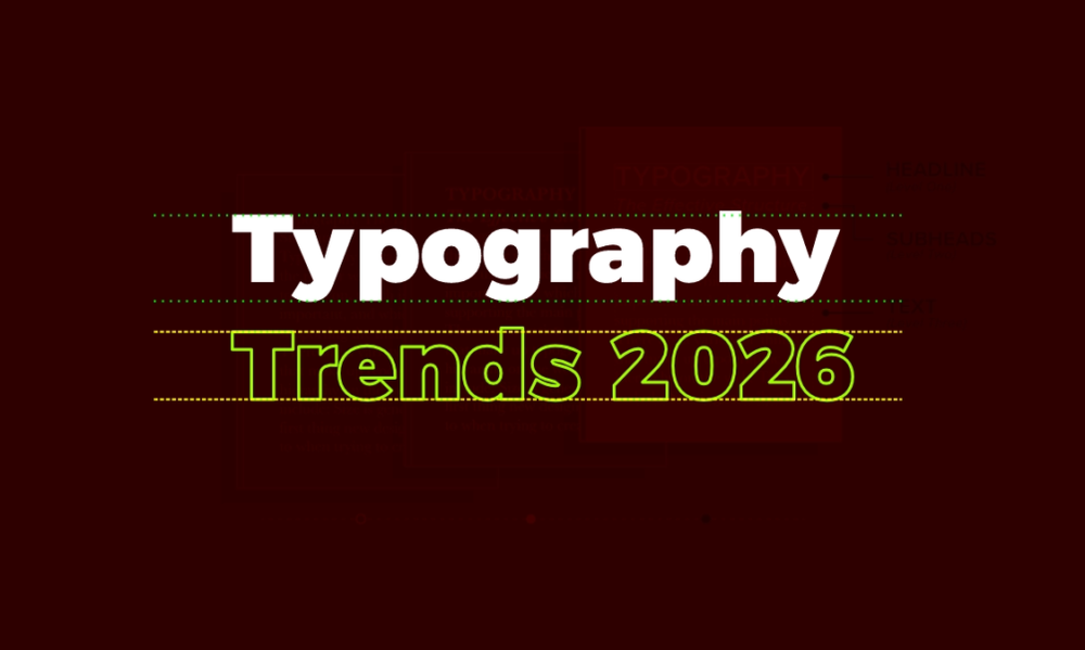
Typography is not decoration, it is communication. The fonts a brand chooses send a signal before a single word is read. In 2026, brand typography trends have shifted firmly toward intentional, trust-first design. Whether you are building a startup identity or refreshing an established brand, the right font choice can increase credibility, improve readability, and turn casual visitors into loyal customers. This post breaks down what is working right now, the psychology behind it, and how to apply it.
Why Typography Decides Whether Your Brand Gets Trusted
Most people form an opinion about a website in under 50 milliseconds. In that split second, typography accounts for a significant part of that judgment, estimated at around 55% of the overall visual impression, based on UX research from Nielsen Norman Group.
That means your font is not just a stylistic preference. It is a trust signal.
The brands that understand this are winning in search, in conversion, and in long-term recall. At memorable.design, we have seen firsthand how a single font switch, done correctly, can lift engagement metrics noticeably.
The Biggest Brand Typography Trends Shaping 2026
1. The Serif Renaissance
For most of the 2010s, sans-serif ruled the digital world. Clean, minimal, and screen-friendly, it felt modern. But in 2026, serif fonts are making a confident return, especially in premium branding and editorial design.
Why? Because readers associate serifs with authority, tradition, and credibility. Think of legacy publications like The New York Times or The Economist. Their typographic choices are deliberate, serifs say: we have been here a while, and we know what we are talking about.
Brands in finance, law, healthcare, and education are leading this shift. Fonts like Canela, GT Sectra, and Freight Display are appearing in brand identities that want to feel established without feeling old.
2. Variable Fonts Are Now a Standard, Not a Trend
Variable fonts allow a single font file to contain multiple weights, widths, and styles. This was a niche conversation in 2021, it is now a baseline expectation in typography for web in 2026.
The practical benefits are real:
- Faster page load times (one file instead of many)
- Smoother responsive behavior across screen sizes
- More expressive animation possibilities without performance cost
Google Fonts now offers hundreds of variable fonts, making them accessible for teams of every budget.
3. Human and Handcrafted Type
Geometric perfection is giving way to slightly imperfect, humanist letterforms. Brands want to feel approachable, not algorithmic. Fonts with visible pen strokes, optical inconsistencies, and warm curves are trending because they feel human in an era when AI-generated content is everywhere.
This is a direct response to audience psychology. When everything else feels machine-made, a handcrafted typeface stands out.
Serif vs Sans-Serif in 2026: Which One Builds More Trust?
The serif vs sans-serif debate is one of the most persistent in design but the answer is not about which is objectively better. It depends on your brand context.
| Use Case | Recommended Style | Reason |
|---|---|---|
| Finance, Legal, Medical | Serif | Conveys authority and tradition |
| Tech, SaaS, Apps | Sans-Serif | Signals clarity and modernity |
| Lifestyle, Fashion | Either (with intention) | Aesthetic flexibility |
| Editorial, Publishing | Serif | Readability at length |
| Startups (early stage) | Geometric Sans-Serif | Feels fresh and scalable |
| Wellness, Mental Health | Humanist Sans-Serif | Warm, approachable tone |
The real shift in 2026 is that brands are mixing both styles, a serif headline paired with a humanist sans-serif body text. This combination scores high on both authority and readability.
Font Psychology: What Every Typeface Is Really Saying
Font psychology is the study of how typeface choices influence perception, emotion, and decision-making. It is not abstract theory — it has measurable effects.
Here is a practical breakdown:
| Font Category | Psychological Association | Best Fit For |
|---|---|---|
| Old-Style Serifs (e.g., Garamond) | Trust, history, elegance | Law firms, publishing |
| Modern Serifs (e.g., Didot) | Luxury, sophistication | Fashion, premium retail |
| Slab Serifs (e.g., Rockwell) | Strength, reliability | Automotive, sports, construction |
| Geometric Sans (e.g., Futura) | Clean, rational, modern | Tech, finance, architecture |
| Humanist Sans (e.g., Gill Sans) | Friendly, accessible | Healthcare, education |
| Monospace (e.g., Courier) | Technical, neutral | Developer tools, documentation |
Understanding these associations is the foundation of intentional brand typography. At memorable.design, every type recommendation starts with brand personality mapping because the wrong font in the right color is still the wrong font.
Typography for Web: The Technical Side of Trust
Hierarchy Creates Clarity
A page with no typographic hierarchy looks like noise. Readers abandon noisy pages. Strong typography for web means establishing a clear system:
- H1: Primary message — largest, most weight
- H2/H3: Supporting structure — guides skimming
- Body: Comfortable, readable, consistent
- Captions/Labels: Small but deliberate — never an afterthought
The Right Size Is Not Optional
The minimum recommended body font size for web in 2026 is 16px. Anything smaller increases bounce rate, particularly on mobile. Estimated 60–70% of web traffic now comes from mobile devices (based on available global data), making this non-negotiable.
Line Length and Spacing
Optimal line length for body text is 50–75 characters. Too wide, and the eye gets lost. Too narrow, and reading feels choppy. Line height (leading) should be around 1.5x the font size for body copy, this is one of the most overlooked improvements teams can make.
System Fonts vs Custom Web Fonts
Custom web fonts add personality but come with performance considerations. System font stacks (like Apple's San Francisco or Google's Roboto) load instantly and look native. A best-practice approach:
- Use custom fonts for headlines and branding moments
- Default to system fonts for long-form body text if performance is a priority
- Always subset your fonts to load only the characters you actually use
Common Typography Mistakes That Undermine Brand Trust
Even brands with solid design budgets get this wrong. Here are the patterns we see most often:
- Using too many typefaces. Two fonts is a system. Three is the maximum. Four is chaos.
- Ignoring contrast ratios. WCAG 2.2 requires a 4.5:1 contrast ratio for normal text. Low contrast signals carelessness.
- Mismatching font personality with brand voice. A playful script font for a cybersecurity firm does not communicate safety.
- Inconsistent sizing across platforms. Your website, app, and social media should feel like the same brand.
- Treating mobile as an afterthought. Fonts that work on desktop often break on small screens without testing.
How to Choose a Font That Builds Trust: A Simple Framework
If you are making a font decision for your brand right now, use this process:
- Define your brand personality (3–5 adjectives)
- Identify your primary audience and their expectations
- Research competitors' typography — decide whether to align or differentiate
- Test readability at multiple sizes and on multiple devices
- Check licensing — many beautiful fonts are not cleared for commercial use
- Pair deliberately — choose a headline and body font with clear contrast but compatible tone
This is the approach the team at memorable.design uses with every brand project, and it removes the guesswork from what can otherwise feel like a subjective decision.
Key Takeaways
- Brand typography trends in 2026 favor intentional, trust-first choices over purely aesthetic ones
- Serifs are back — especially in industries where authority matters
- Font psychology is a real, measurable factor in how audiences perceive credibility
- Great typography for web means hierarchy, sizing, spacing, and performance — not just a pretty typeface
- The serif vs sans-serif debate is less important than matching font personality to brand purpose
Frequently Asked Questions
Q: What are the top brand typography trends in 2026?
Serif revivals, variable fonts, humanist type, and trust-first font pairings are leading in 2026. Brands are prioritizing legibility and personality over minimalism alone.
Q: Is serif or sans-serif better for building trust online?
It depends on your industry. Serifs build authority and tradition; sans-serifs signal clarity and modernity. Many top brands now use both in a deliberate pairing.
Q: How does font psychology affect conversions?
Fonts shape first impressions within milliseconds. A mismatch between font personality and brand message can reduce perceived credibility and increase bounce rates, even when the content itself is strong.
Q: What is the best font size for web in 2026?
A minimum of 16px for body text, with H1 headlines typically between 32–56px depending on layout. Line height should be approximately 1.5x the font size.
Q: How many fonts should a brand use?
Two is ideal — one for headlines, one for body text. Three is the acceptable maximum. More than three typically creates visual inconsistency and weakens brand recognition.
Want expert guidance on your brand's typography system? Visit memorable.design to explore how intentional type choices can transform your brand identity.
0 Comments