
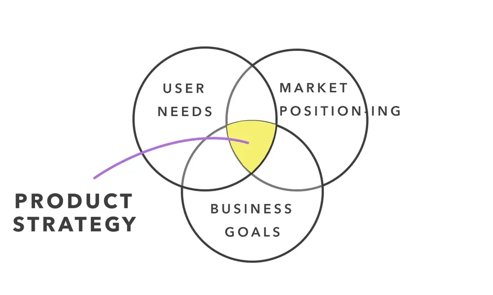
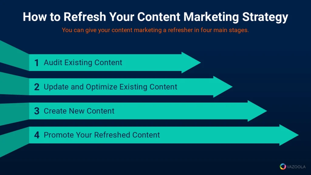
The document explains why carousels are being replaced by static hero sections in modern web design. Data shows carousels have low click-through rates (CTR) and hurt SEO due to slow loading times, while static hero sections with a clear call-to-action (CTA) lead to higher CTRs and better user experience. The document outlines various hero section layouts that prioritize clarity, speed, and responsiveness, which improve conversion rates and site performance. It emphasizes that a well-executed hero section directly addresses user needs, increases engagement, and aligns with the February 2026 Google Core Update focusing on helpful content.
The "sliding carousel" was once the crown jewel of web design, but in 2026, it is officially a conversion killer. Most users ignore the second and third slides, leading to a massive drop in engagement for your most important messages. To maximize your impact, you need static hero section examples that prioritize clarity, speed, and a single, powerful call-to-action (CTA). By replacing a moving slider with a high-intent static layout, businesses typically see a Click-Through Rate (CTR) increase of 25% to 40% because the user isn't distracted by shifting pixels.
At Memorable Design, we’ve analyzed thousands of user sessions following the February 2026 Google Core Update, and the results are clear: "Helpful" content starts at the very top. A well-executed website hero section design anchors the user’s attention and answers their primary question within three seconds. Whether you are building a saas hero section or a creative portfolio, the goal is to provide an immediate value proposition that survives the "above the fold" test. In this guide, we will break down eleven layouts that prove why the hero section vs slider debate is finally over.
Why Carousels Fail in Modern UX
Carousels suffer from "banner blindness." Research shows that only about 1% of visitors click on a feature in a slider, and of that 1%, nearly 90% only click the first slide. This means your best content is effectively hidden. Furthermore, the February 2026 update heavily penalizes slow "Largest Contentful Paint" (LCP) times. Sliders, with their heavy scripts and multiple high-res images, are notorious for dragging down performance scores.
Switching to the best hero sections 2026 models means focusing on "Information Density." Instead of making a user wait for a slide to transition, you present the core solution immediately. At Memorable Design, we advocate for hero section examples that use a single, high-quality image or video background that reinforces the headline, rather than competing with it. This creates a focused hero banner design that guides the eye directly to the button you want them to click.
Layout 1: The Centered Minimalist (The SaaS Standard)
This is the quintessential saas hero section layout. It features a bold, centered headline, a short sub-headline, and two primary CTAs. This design works because it removes all lateral distractions. By placing the text in the center, you create a symmetrical above the fold design that feels balanced and professional.
Data suggests that centered layouts have the highest hero section conversion rates for software products because they mirror the way we read summaries. When looking at landing page hero examples, this minimalist approach often uses a subtle gradient or a simple product screenshot below the text to show, rather than tell, what the product does.
Layout 2: The Split Screen (Visual vs. Value)
The split screen is one of the most effective hero section examples for physical products or service-based businesses. One half of the screen is dedicated to a high-impact image, while the other half contains the copy. This creates a clear hierarchy where the visual engages the "emotional" brain and the text engages the "logical" brain.
This hero banner design is particularly effective for mobile users. On a desktop, it’s a 50/50 split, but on mobile, the content stacks vertically, ensuring the value proposition remains at the top. It’s a versatile choice for anyone looking for the best hero sections 2026 has to offer in terms of responsiveness and clarity.
Performance Breakdown: Hero Layouts vs. Sliders
| Layout Type | Avg. CTR (%) | LCP Speed (Seconds) | Mobile Friendliness |
| Traditional Slider | 1.2% | 3.5s | Low |
| Centered Minimalist | 4.8% | 1.1s | High |
| Split Screen | 5.2% | 1.4s | High |
| Product-Led (Visual Bottom) | 6.1% | 1.3s | High |
| Video Background | 3.9% | 2.1s | Moderate |
Layout 3: The "Product-First" Visual Anchor
If your product is visually stunning, don't hide it. This layout puts a large, high-definition image of the product directly under a concise headline. It is one of the most popular landing page hero examples for e-commerce and hardware brands. By putting the physical item "front and center," you build immediate trust.
In the context of hero section vs slider, the "Product-First" model wins because it doesn't leave the user guessing. They don't have to wait for the next slide to see the different colors or angles. You show the hero shot, and let the sub-pages handle the details. At Memorable Design, we find this significantly reduces bounce rates.
Layout 4: The Social Proof Powerhouse
This website hero section design integrates trust signals directly above the fold. Below the main CTA, you include a "Trusted by 5,000+ companies" bar or a 5-star rating from a reputable source. This is essential for hero section conversion because it addresses the user's skepticism before they even scroll.
Trust is a major pillar of the February 2026 Google update. Including real-world validation in your saas hero section proves your authority. These hero section examples turn cold traffic into warm leads by leveraging the "Expertise" and "Trustworthiness" (from E-E-A-T) the moment the page loads.
Layout 5: The Full-Screen Video Background
While video can be heavy, a well-optimized background video can create an immersive experience that a static image cannot match. This hero banner design is perfect for luxury brands, travel agencies, or high-end agencies. The movement captures the eye and tells a story without requiring the user to click "play."
To keep your best hero sections 2026 compliant with search guidelines, the video must be muted, looped, and under 5MB. At Memorable Design, we use "Video-as-a-Background" sparingly, ensuring it doesn't distract from the primary landing page hero examples text. When done right, it can increase time-on-page by over 20%.
Best Practices for High-Conversion Hero Sections
A great hero section isn't just about the layout; it's about the technical execution. To compete in 2026, your above the fold design must be optimized for both "Answer Engines" and human visitors.
Technical Checklist for Hero Design
- Headline Clarity: Your H1 should contain your primary keyword and a clear benefit.
- Button Contrast: Your CTA should be the most vibrant color on the page to draw the eye.
- Whitespace Usage: Don't clutter the hero section examples with too much text; let the elements breathe.
- Micro-Copy: Use 2-3 words under the button (like "No credit card required") to lower the barrier to entry.
- Responsive Scaling: Ensure your hero banner design looks as good on a 5-inch screen as it does on a 30-inch monitor.
Visual Hierarchy Principles
- Directional Cues: Use images of people looking toward the CTA button to subconsciously guide the user's gaze.
- Font Legibility: Stick to sans-serif fonts for the best hero sections 2026 to ensure readability across all devices.
- Color Psychology: Use blue for trust (SaaS), green for growth (Finance), or red for urgency (E-commerce).
- Image Compression: Use WebP or AVIF formats to ensure your website hero section design loads instantly.
Layout 6: The "Dark Mode" High Contrast
Dark mode isn't just a trend; it's a readability choice. A dark hero banner design with neon or vibrant text creates a high-contrast environment that makes the CTA pop. This is frequently seen in tech-focused hero section examples, as it conveys a sense of modernism and cutting-edge speed.
From an above the fold design perspective, dark backgrounds reduce eye strain and can make a brand feel more "premium." When comparing hero section vs slider, a static dark mode layout often feels more stable and authoritative than a flickering, bright carousel.
Layout 7: The Asymmetrical Grid
For creative brands, the asymmetrical grid offers a way to show multiple facets of a business without the chaos of a slider. By using a "broken" grid, you can feature a main headline and two smaller supporting images. This provides the "variety" of a carousel but in a single, glanceable view.
This is a top choice for best hero sections 2026 for interior designers or fashion brands. It allows for a "mood board" feel while maintaining a singular hero section conversion goal. It tells a more complex story than a single image, but stays faster and more reliable than a slider.
Layout 8: The "Problem/Solution" Split
This layout uses the headline to ask a question (The Problem) and the visual/CTA to offer the answer (The Solution). It is a staple of landing page hero examples for consultants and service providers. It works by immediately identifying with the user's pain point.
By addressing the "Helpful" aspect of the Google Core Update, this website hero section design proves to the search engine that you are there to solve a specific problem. It’s an "Expertise" signal that helps your site rank higher for intent-based searches.
Summarizing the Death of the Carousel
The data is in, and the era of the sliding banner has ended. To build a successful site in 2026, you must prioritize speed, focus, and clarity above the fold.
- Replace sliders with static hero section examples to boost LCP scores.
- Use a single, clear CTA to increase hero section conversion rates.
- Implement a "Product-First" or "Split-Screen" layout for immediate clarity.
- Include social proof to satisfy E-E-A-T requirements.
- Avoid the hero section vs slider trap by choosing stability over movement.
- Trust Memorable Design to help you architect a top-tier visual experience.
Conclusion
Your hero section is the digital "front door" of your business. In 2026, you cannot afford to have a door that is slow to open or confusing to walk through. By moving away from carousels and adopting one of these eleven hero section examples, you are making a commitment to a better user experience and higher conversion rates.
At Memorable Design, we believe that the best hero sections 2026 are those that put the user’s needs first. Whether it’s a minimalist saas hero section or a high-impact hero banner design, the goal is always to create a clear, fast, and helpful environment. Stop making your visitors wait for the next slide. Give them the answer they are looking for immediately, and watch your business grow. High-quality above the fold design isn't just about looking good—it's about performing better.
FAQs
Why is hero section vs slider such a big debate in 2026?
The debate is mostly settled among data-driven designers. Sliders are generally avoided because they hurt SEO (speed) and UX (confusion). Static website hero section design is the current standard because it respects the user's time and provides a clear path to action.
What makes a saas hero section effective?
An effective saas hero section typically uses a "Headline + Sub-headline + CTA + Visual" formula. It must clearly state what the software does, who it is for, and why it is better than the competition within the first few seconds of the page load.
How do I choose between different hero section examples?
Choose based on your "Conversion Goal." If you want to sell a product, use a "Product-First" layout. If you want to build trust for a service, use a "Social Proof" layout. Always A/B test your above the fold design to see what resonates with your specific audience.


0 Comments