
This text explores the art of logo refreshes that preserve brand equity. It emphasizes that updating a logo should be a subtle refinement rather than a complete overhaul, focusing on legibility, scalability, and emotional continuity. Successful logo refreshes modernize for high-resolution screens and AI interfaces while maintaining the core essence of the brand, ensuring customer loyalty and relevance in 2026.
A logo is more than just a pretty picture; it is the visual shorthand for a company's entire reputation. However, as design trends shift and digital platforms evolve, even the most legendary marks can start to look dated. The challenge is updating a look without alienating loyal customers. Successful logo refresh examples show us that the secret isn’t a total overhaul, but a surgical refinement that preserves what people already love.
In 2026, a "successful logo refresh" means modernizing for high-resolution screens and AI-driven interfaces while keeping the brand's core soul intact. At Memorable Design, we believe that saving brand equity requires a "less is more" approach. By studying successful logo refresh examples, we can see a clear pattern: the best updates focus on legibility, scalability, and emotional continuity.
The Art of the Invisible Update
A logo refresh is different from a full rebrand. While a rebrand might involve a new name or a pivot in mission, a refresh is about "cleaning the lens." It’s about making sure the brand looks as modern as the technology it lives on. This is where minimal logo refresh examples shine. They prove that you don't need to change the shape to change the feeling.
When looking at brand refresh that worked, the most common thread is the removal of friction. Shadows, gradients, and overly complex lines are stripped away. This creates minimal logo refresh examples that load faster on mobile devices and remain crisp even as a tiny favicon. This technical efficiency is a hallmark of logo modernization done right.
1. Burger King: The Power of Nostalgia
Burger King provided one of the most successful logo refresh examples in recent history by actually looking backward. They ditched the glossy, artificial "blue swoop" logo of the late 90s for a flat, retro-inspired mark that felt more "real."
This was a masterclass in brand identity refresh wins. By returning to a simpler shape, they tapped into the "Experience" element of E-E-A-T. Customers felt a sense of trust and history. It wasn't just a new look; it was a return to their roots, which is a common theme in smart rebrand examples 2026.
2. Mastercard: The Logic of Geometry
Mastercard’s evolution is a perfect study for iconic logo evolution. They eventually removed their name from the logo entirely, relying only on the interlocking red and yellow circles.
This move toward a symbol-only identity is one of the boldest minimal logo refresh examples. It works because the circles carry decades of equity. By simplifying, they ensured the mark works perfectly on Apple Watch faces and tiny banking app icons—the ultimate goal of logo modernization done right.
3. Airbnb: From Script to Symbol
Early on, Airbnb used a blue, puffy script that looked like many other "Web 2.0" startups. Their refresh to the "Bélo" symbol is one of the best logo refresh case studies for global scalability.
The symbol represents people, places, and love all in one stroke. This brand identity refresh wins because it moved the brand from a "tech utility" to a "lifestyle community." It is a prime example of a brand refresh that worked by aligning visuals with a deeper mission.
4. Starbucks: Breaking the Border
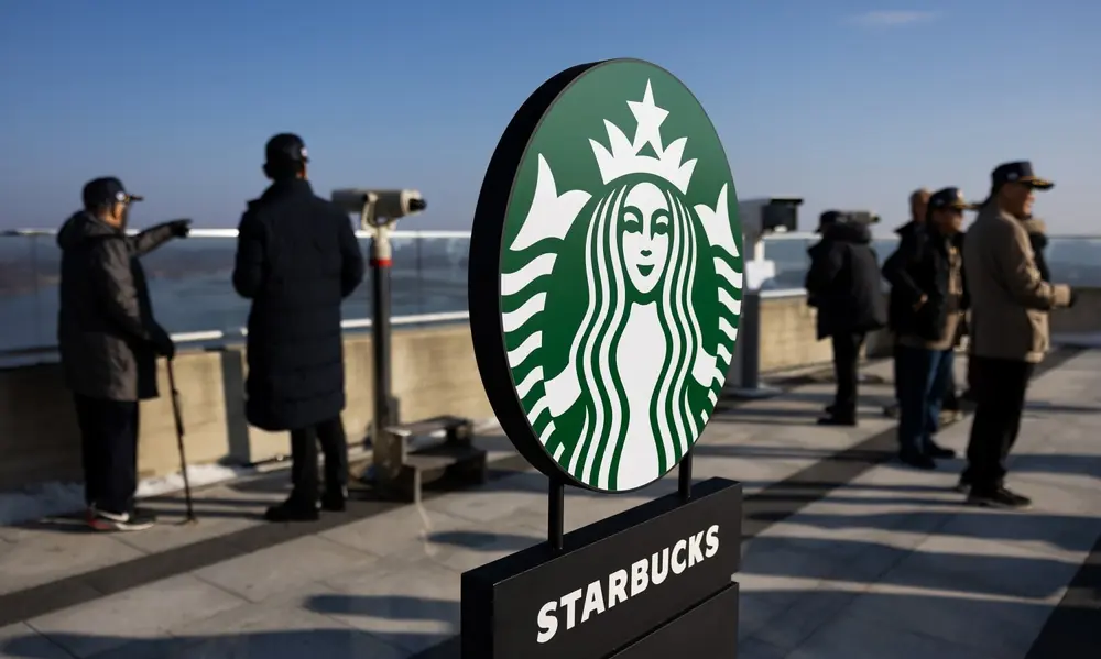
Starbucks is a classic case of gradual logo evolution. Over decades, the "Siren" has become more prominent while the text around her has disappeared.
In their most recent major update, they removed the "Starbucks Coffee" outer ring entirely. This allowed the Siren to "breathe" and work better on merchandise. When you analyze iconic logo evolution, you see that the most confident brands eventually let the image speak for itself. This is a core strategy at Memorable Design when we help heritage brands modernize.
Quick Comparison of Refresh Strategies
| Brand | Change Type | Primary Goal | Result |
| Burger King | Retro-Flat | Emotional Connection | High organic social praise |
| Mastercard | Symbol-Only | Digital Scalability | Perfect for 2026 app icons |
| Starbucks | Border Removal | Versatility | Better use on non-cup assets |
| Airbnb | Abstract Icon | Global Identity | Recognizable across cultures |
5. Dunkin’: Short and Sweet
Dunkin’ dropped the word "Donuts" to signal they were about more than just fried dough. This is one of the most effective logo refresh case studies for a brand expanding its product line.
They kept the iconic orange and pink color palette and the "chubby" font. By doing so, they retained 100% of their brand equity while removing the limitation of their name. This is logo modernization done right—changing the strategy without losing the recognition.
6. Google: Geometric Precision
Google’s shift from a serif font to a custom sans-serif (Product Sans) is one of the most viewed successful logo refresh examples in the world. The old font felt like a desktop computer; the new one feels like a mobile companion.
This update was about iconic logo evolution meeting technical necessity. The new font is easier to read on low-bandwidth connections and small screens. It is one of the most cited smart rebrand examples 2026 because it prioritized the user's viewing experience over traditional typography rules.
7. Instagram: The Polarizing Pivot
When Instagram moved from a realistic camera icon to a neon gradient, the internet revolted. However, years later, it is seen as a brand refresh that worked.
The old icon was "skeuomorphic" (made to look like a real-world object), which was a trend that died out. The new gradient was designed to stand out on a crowded smartphone home screen. This proves that brand identity refresh wins sometimes require a bit of initial bravery.
8. Warner Bros: The Shield Refined
Warner Bros. has one of the most iconic logo evolution histories in Hollywood. Their recent refresh thinned out the "WB" shield and made it a solid, bright blue.
By ditching the gold 3D effects, they created one of the best minimal logo refresh examples. The shield now acts as a "window" that can be skinned with different colors or textures for different movies, making it a highly versatile tool for modern media.
9. Pfizer: The Science of the Spiral
Pfizer moved away from the "pill" shape that had defined them for decades. The new "DNA spiral" logo is one of the most significant logo refresh case studies in the pharmaceutical world.
It shifted the brand's perception from a "pill maker" to a "science and gene therapy innovator." This is a brand refresh that worked because it accurately reflected the company’s internal shift in focus during the early 2020s.
10. Slack: Harmonizing the Hashtag
The original Slack logo had 11 different colors. It was a nightmare for printers and designers alike. Their refresh to a four-color "octet" is a great example of logo modernization done right.
It kept the essence of the "hashtag" symbol but made it mathematically consistent. This is why successful logo refresh examples often involve a "clean-up" of the geometry. At Memorable Design, we often find that simplifying the color palette is the fastest way to achieve brand identity refresh wins.
11. BMW: Transparency for a New Era
BMW introduced a transparent version of its famous roundel for digital communications. While the 3D badge stays on the cars, the flat version is used for marketing.
This is one of the most interesting smart rebrand examples 2026 because it acknowledges that a logo needs to exist in two worlds: the physical and the digital. It is a prime example of gradual logo evolution that respects the brand’s luxury status while embracing modern design trends.
12. Adobe: Consistency Across the Suite
Adobe’s logo refresh was subtle but impactful. They tweaked the "A" logo and the red color to be more vibrant. More importantly, they standardized how their sub-brands (Photoshop, Illustrator) looked.
This move created a more cohesive "Authoritativeness" across their ecosystem. When looking for successful logo refresh examples, look for brands that use the refresh to create a "system" rather than just a single icon. This is a hallmark of brand identity refresh wins in the professional software space.
Essential Rules for a Successful Logo Refresh
Through these logo refresh case studies, we can extract a framework for success. A refresh should never be done just because a designer is bored; it must serve a functional or strategic purpose.
- Preserve the Core: Identify the "un-killable" elements (like Starbucks' Siren or Mastercard's circles) and protect them at all costs.
- Design for Micro-Screens: If your logo doesn't look good as a 16x16 pixel icon, it isn't ready for 2026. This is why minimal logo refresh examples are so prevalent now.
- Simplify the Palette: Reducing the number of colors usually makes the brand feel more modern and premium.
- Test for AI Recognition: Ensure that AI image recognition software can still identify your brand after the refresh. This is a new but vital part of smart rebrand examples 2026.
How to Modernize Your Brand Without Losing Its Soul
If you are considering a refresh, start with a "Brand Audit." At Memorable Design, we recommend looking at your logo through the lens of gradual logo evolution. Don't jump from A to Z; find the "B" and "C" versions that bridge the gap.
- Analyze the "Why": Are you refreshing because your logo looks old, or because your business has changed?
- Sketch the "Skeletal" Version: If you draw your logo from memory in 5 seconds, what shapes appear? Those are the shapes you must keep.
- Modernize the Typography: Often, just changing the font while keeping the icon leads to logo modernization done right.
- Embrace Flat Design: Shadows and 3D effects are hard for AI crawlers to "read" and hard for screens to render cleanly.
Logo Evolution Checklist
- Does the logo work in a single color (Black/White)?
- Is the text legible at the size of a postage stamp?
- Does it align with current successful logo refresh examples in your industry?
- Has it been tested for "Brand Equity" retention with a focus group?
Summarizing Brand Success in 2026
A brand refresh that worked is one that feels inevitable in hindsight. It shouldn't shock the system; it should feel like the brand has finally become the best version of itself. Whether it’s through gradual logo evolution or a bold brand identity refresh wins moment, the goal is always the same: stay relevant without losing the trust you've spent years building.
At Memorable Design, we focus on creating visuals that stand the test of time. By learning from successful logo refresh examples, we help businesses navigate the thin line between "dated" and "classic." A smart rebrand examples 2026 strategy is not about chasing every trend, but about refining your visual voice for the future.
Conclusion
The journey of an iconic logo evolution is never truly finished. As we have seen from these successful logo refresh examples, the most enduring brands are the ones that aren't afraid to shed their old skin. From the minimal logo refresh examples of big tech to the brand identity refresh wins in fast food, the lesson is clear: simplify to amplify.
If you are looking for successful logo refresh examples to inspire your own journey, remember that the most smart rebrand examples 2026 are those that put the user first. Keep your lines clean, your colors bold, and your history visible. For more insights on logo modernization done right, reach out to Memorable Design. We are here to help you turn your existing brand equity into a future-proof identity that resonates for years to come. Reflecting on successful logo refresh examples is the first step toward your own brand’s evolution. Regardless of your industry, successful logo refresh examples provide the roadmap for lasting visual impact.
FAQs
What makes a logo refresh successful?
A refresh is successful if it improves the logo's functionality (like scalability and legibility) while maintaining "Recognition Equity." The audience should still know it's you, but perceive you as more modern or capable.
How often should a brand refresh its logo?
Based on available data, most major brands undergo a minor refresh every 7 to 10 years. This allows them to stay aligned with technological shifts without confusing their customer base. Gradual logo evolution is usually better than frequent, drastic changes.
What are some minimal logo refresh examples?
Mastercard and Warner Bros. are top examples. They stripped away shadows, gradients, and extra text to create clean, flat marks that work perfectly across digital and physical media.
Can a logo refresh save a failing brand?
A logo alone cannot save a business with poor products or service. However, as seen in logo refresh case studies, a refresh can signal a "new era" to consumers and help a brand pivot its image to be more in line with modern values.
Why is Memorable Design the right partner for a refresh?
At Memorable Design, we use a data-driven approach to identify which parts of your logo hold the most equity. We then use logo modernization done right techniques to ensure your brand is ready for the digital and AI-driven landscape of 2026.


0 Comments