
A strong brand guidelines system is built on strict rules for typography, spacing, color systems, and logo usage. Studying free brand guidelines PDFs from companies like Google, Apple, NASA, and Spotify helps designers understand how global brands maintain consistency at scale. These style guides show how to structure visual identity, avoid misuse, and create cohesive design systems that stay consistent across all platforms and assets.
Designing a comprehensive brand identity system from scratch can feel completely overwhelming. You have to balance typography pairing rules, manage strict logo clear space requirements, and outline precise grid layouts without losing the overall creative vision. When you face creative blocks, the absolute best solution is to look at how the world's most successful organizations document their systems.
Studying real-world corporate manuals gives you a practical, behind-the-scenes look at professional asset management and visual layout execution. We have gathered 15 premium, publicly available style guides from world-class organizations so you can see exactly how global systems are structured. Use these examples to find a free brand guidelines pdf or brand book pdf download that will help you confidently build out your next identity system.
At Memorable Design, we believe that studying master-level documentation is the fastest way to elevate your own design standard. Instead of guessing how to structure your padding, color codes, or editorial tone, you can learn directly from the detailed rulebooks of foundational enterprises.
Why Top Brands Share Their Guidelines Publicly
It might seem strange for a major global corporation to offer an open brand book pdf download to the public. However, these documents are not secret corporate strategies; they are essential reference toolkits built to protect visual identity at a massive global scale.
When a multi-national corporation coordinates hundreds of external marketing agencies, global printing houses, and localized product engineering teams, maintaining visual consistency becomes an immense challenge. Providing open access to their famous brand guidelines ensures that any partner, developer, or publisher can instantly find the exact specifications they need. This proactive transparency completely eliminates formatting errors, unauthorized color variations, and stretched vector logos before they ever reach the market.
Technical Benchmarks of Global Style Guides
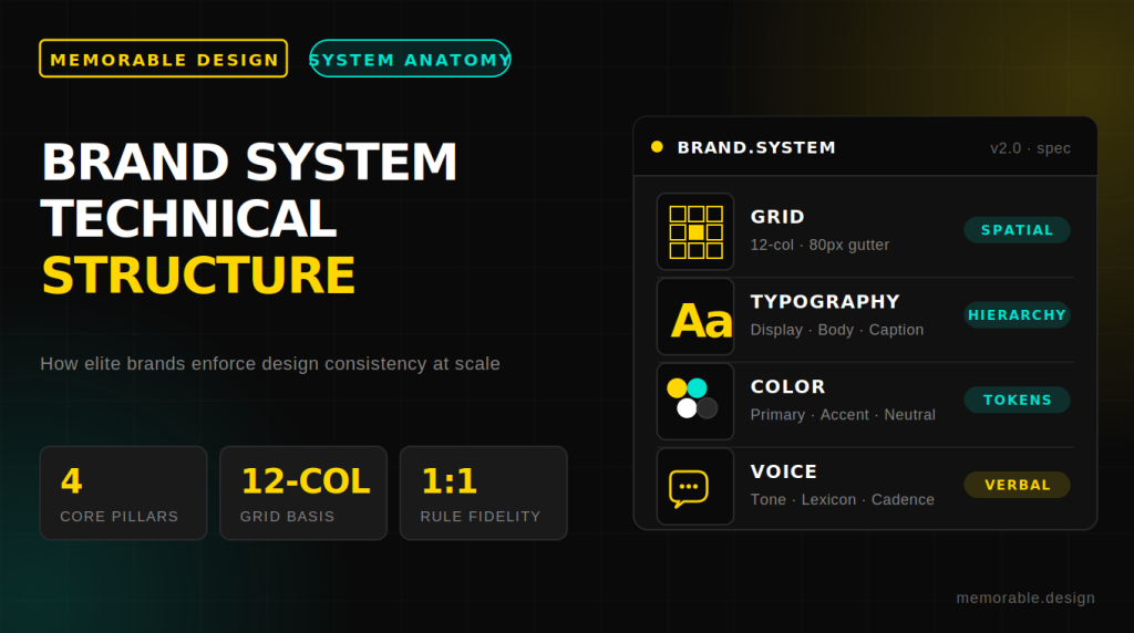
Every world-class brand identity manual examples archive shares an identical core objective: removing visual ambiguity. Before diving into the full list of public assets, analyze how elite systems divide their technical specifications to keep their production workflows flawlessly unified.
| Core System Layer | Technical Elements Addressed | Primary Execution Strategy |
| Visual Architecture | Grid units, padding zones, aspect ratios. | Use strict bounding containers (e.g., $1X$ or $0.25X$ logo height) to keep asset breathing room completely uniform. |
| Typographic Hierarchy | Font families, line heights, tracking. | Define exact fallback typefaces (like Arial or Helvetica) for digital spaces where custom corporate weights cannot render. |
| Chromatic Systems | Swatches, accessibility scores. | Provide explicit breakdowns for PANTONE, CMYK, RGB, and Hex codes to maintain true color accuracy across print and screens. |
| Voice and Tone | Copywriting styles, punctuation. | Outline explicit "Do and Don't" contextual copywriting examples to keep messaging fully aligned across support teams. |
15 Famous Brand Guidelines to Study and Download
These 15 public brand style guides represent a diverse range of industries, including tech platforms, scientific institutions, cultural hubs, and historic transport networks. Each example offers distinct, highly practical formatting lessons that you can easily adapt for your own creative projects.
Tech and Media Powerhouses
1. Google Brand Guidelines
The google brand guidelines system is widely regarded as a masterclass in modern digital-first ecosystem design. It goes far beyond standard logo placement to explain the complex, mathematical spacing logic behind their signature multi-colored asset styling. By downloading this digital framework, you can see how they cleanly balance strict minimalism with vibrant, primary brand colors across dozens of independent software products.
2. Spotify Brand Guide
The spotify brand guide focuses heavily on maintaining strict visual integrity across varying digital environments. It outlines non-negotiable rules for their signature icon placement, explicit background contrast requirements, and precise color-matching rules for their iconic green branding. This document is highly recommended if you need to build responsive, accessible software layouts that look crisp on everything from tiny mobile screens to large desktop monitors.
3. Apple Identity Guidelines
Apple approaches its corporate documentation with the exact same minimalist refinement it applies to its hardware packaging. This clean manual outlines the precise exclusion zones required around the world-famous silhouette logo, handles premium typography rules, and sets strict display hierarchies for external reseller marketing. It is a brilliant case study in using generous negative space to establish a high-end, premium market position.
4. Netflix Brand Portal
The Netflix system is centered entirely around maximizing global entertainment recognition and on-screen asset legibility. It provides detailed production rules for their iconic red corporate logotype, the precise arc dimensions of their symbol, and how their assets must behave on varying video backgrounds. This guide is an invaluable asset if you are designing layout systems for dynamic, motion-first media platforms.
5. TikTok Creative Manual
TikTok’s style guide shows designers how to manage high-energy, digital-native visual assets without letting layouts descend into pure chaos. It documents the exact vector offsets required to recreate their signature layered neon chromatic glitch effect, outlines youth-focused editorial rules, and sets strict sizing rules for digital video overlays.
Pro Tip on Asset Scaling: When reviewing a brand identity manual examples archive, pay close attention to how logos adjust across varying sizes. Top systems always utilize a secondary, simplified layout version for small mobile screens (like a 16px favicon) to keep paths perfectly legible.
Space, Science, and Cultural Institutions
6. NASA Brand Guidelines
The legendary 1976 nasa brand guidelines (specifically the classic Graphics Standards Manual) stands as an enduring monument to structural modernist design. This historic document outlines the typographic geometry of the famous clean red "Worm" logotype, handles vehicle livery graphics, and maps out signage systems for space centers. It shows how a massive government agency can use simple typography to convey deep technical precision and future-focused authority.
7. British Broadcasting Corporation (BBC)
The BBC system is a masterclass in managing a massive, multi-channel broadcast portfolio under one cohesive identity. Their documentation explains how to implement the custom BBC Reith font family across vastly different program genres while keeping the core corporate blocks perfectly unified. It provides excellent organizational inspiration if you are structuring layout hierarchies for complex, content-heavy media websites.
8. New York City Transit Authority (NYCTA)
The historic 1970 NYCTA Graphic Standards Manual by Massimo Vignelli is arguably one of the most influential urban signage systems ever created. It completely revolutionized public transit layout logic by introducing strict color-coded routes and clean white typography on rich black backgrounds. This classic blueprint is essential reading for anyone interested in functional information design, modular grid layouts, and clean public navigation systems.
9. Mozilla Open Source Manual
Mozilla's public style guide is explicitly engineered to support decentralized, community-driven development networks. It offers an incredibly practical look at accessible layout systems, providing open-source font pairing alternatives, flexible grid layouts, and vibrant color palettes that anyone can apply. It is a fantastic template to study if you are designing a brand book for a community-led project or a non-profit organization.
10. Uber Design System
Uber’s identity system handles global mobility mapping with absolute clarity. Their digital documentation provides detailed visual guidelines for high-contrast interactive maps, responsive UI components, and accessible localized signage layouts. It is an exceptional resource for learning how to scale a visual system across completely different cultural markets without losing core brand recognition.
Lifestyle, Commerce, and Global Networks
11. Starbucks Creative Guide
The Starbucks identity system elegantly bridges the gap between digital mobile interfaces and tactile, real-world retail packaging. Their public manual demonstrates how to beautifully pair their iconic green primary brand colors with soft, seasonal accent tones and custom hand-drawn illustrations. It serves as a beautiful case study for lifestyle brands that want to feel warm, human, and inviting while maintaining strict corporate consistency.
12. Audi Corporate Identity
Audi’s documentation treats graphic layout design with the exact same rigorous engineering precision they apply to their vehicles. Their style manual outlines an incredibly strict mathematical grid system, precise asymmetric typography placements, and explicit guidelines for rings logo application across corporate offices. This resource is highly recommended if your project requires a sharp, luxury aesthetic balanced with strict technical execution.
13. Mailchimp Brand Book
Mailchimp’s guide is widely celebrated for revolutionizing corporate documentation by introducing an incredibly detailed voice and tone framework. Alongside rules for their playful yellow color schemes and expressive mascots, it provides a comprehensive manual on how to write clear, empathetic, and witty interface copy. It is the ultimate resource for learning how to inject a distinct, human personality into a digital brand experience.
14. Slack Brand Center
The Slack design system is focused entirely on making professional collaboration feel light, efficient, and distinctly human. Their brand book provides clear, actionable instructions for handling their octothorpe logo, maintaining white space balance, and applying cheerful color swatches. It is a wonderful example of how to make enterprise software feel welcoming, modern, and incredibly easy to navigate.
15. Red Cross Visual Identity
The International Red Cross style guide is built around one single, critical priority: maintaining absolute visual clarity during global humanitarian crises. Because their emblem requires instant recognition across disaster areas, their documentation enforces uncompromising rules for color contrast, symbol placement, and language translations. This manual provides an essential lesson in how stripped-back, high-utility design can serve a vital global purpose.
Organizing and Structuring Your Own Guidelines
When you are ready to compile your findings into a downloadable brand book for your own business or client, avoid simply dumping raw design files into a chaotic folder. Structure your documentation to serve as a practical, easy-to-navigate tool.
- Establish Clear Asset Access: Group all your primary vector files, core typefaces, and color swatches into one centrally organized, easily accessible digital folder.
- Show Contextual Application Examples: Always display your brand assets applied within real-world scenarios, such as mocked-up business cards, website layouts, or social media templates.
- Include Clear Wrong Use Cases: Create a dedicated "Incorrect Usage" section displaying stretched paths, distorted colors, or cluttered layouts to explicitly show production teams what mistakes to avoid.
Frequently Asked Questions
Where can I find a legitimate free brand guidelines pdf for educational study?
Many global organizations and design institutions host their complete historical and modern style manuals on public archives, open-source code repositories, and dedicated corporate brand centers. These assets are shared openly to help external creative partners and design students maintain strict visual alignment.
Why do the nasa brand guidelines remain so popular among modern designers?
The 1976 NASA Graphics Standards Manual remains incredibly popular because it represents the absolute peak of modernist information design. Its iconic use of clean geometric typography and modular grid systems serves as a timeless masterclass in balancing bold visual style with high-utility functionality.
What is the difference between a brand book pdf download and a standard style guide?
A standard style guide usually focuses strictly on baseline visual assets like logo variations, primary color codes, and core typography choices. A comprehensive brand book goes much deeper to document high-level corporate foundations, such as the company’s core mission statement, target audience personas, and distinct copywriting voice.
How often should a growing business update its internal iconography and style guides?
A growing business should audit its asset documentation every 12 to 18 months. This regular review ensures your guidelines seamlessly adapt to new social media formats, changing software accessibility standards, and updated marketing layouts without losing your core brand recognition.
Conclusion
Building a truly iconic identity system requires a disciplined balance of creative vision and strict technical boundaries. By downloading and studying a free brand guidelines pdf from organizations like Google, NASA, or Spotify, you gain a clear understanding of how to manage assets at a global scale. Implement these structured layout rules and precise formatting principles across your own projects to watch your visual cohesion thrive.
