
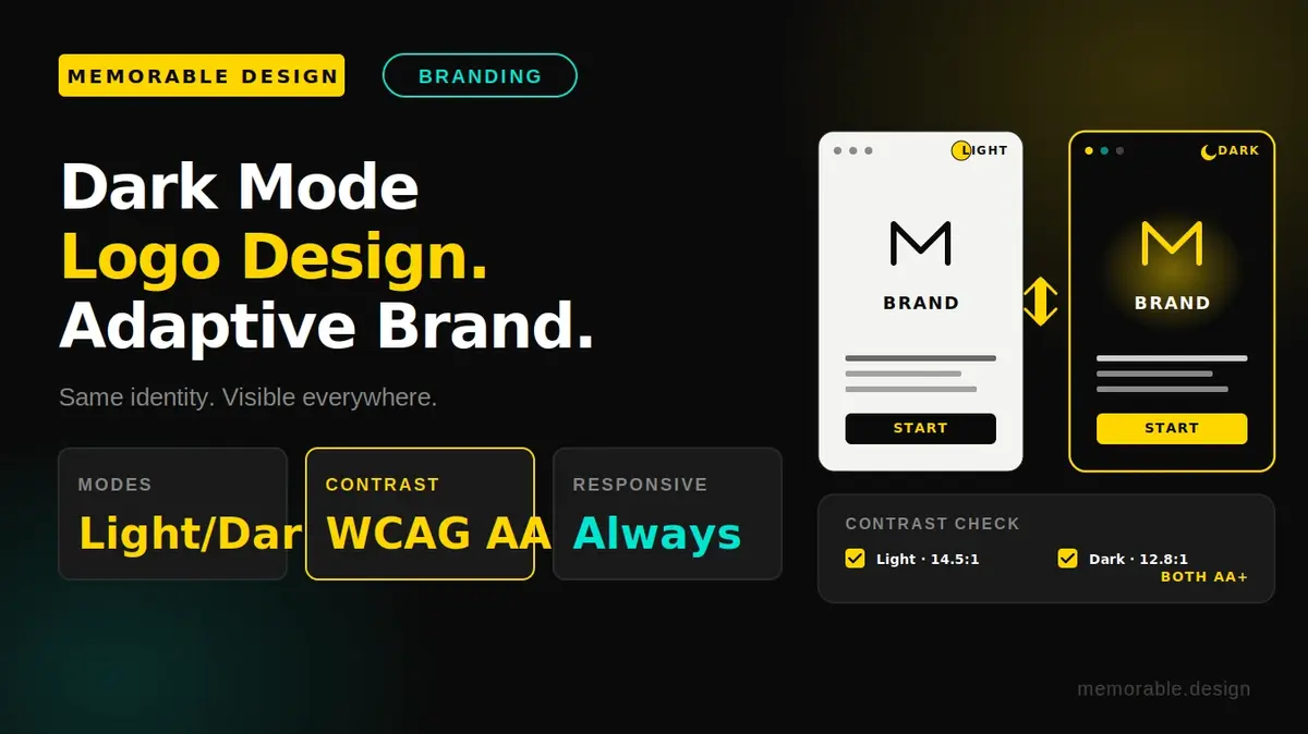
Dark mode can make traditional logos unreadable because dark colors lose contrast on dark backgrounds. Modern brands now use adaptive logo systems that automatically adjust colors, shapes, and line thickness for better visibility across devices and themes. Using responsive SVG assets, color optimization, and flexible design rules helps maintain strong branding, readability, and a polished user experience in both light and dark interfaces.
Have you ever flipped your favorite mobile app into dark mode, only to watch a brand's beautiful logo completely vanish into the shadows? It happens constantly because traditional logos are built to sit on clean, white paper or bright website backgrounds. When a user switches their interface theme, dark text on a dark background becomes impossible to read, destroying brand recognition instantly. To keep your brand looking flawless across all digital devices, mastering dark mode logo design is no longer an optional design choice; it is a critical requirement for modern branding.
The solution to this problem is a dynamic approach known as an adaptive logo system. Instead of forcing a single static image to work on every screen, modern design relies on a flexible framework that detects a user's system preferences and serves a perfectly optimized asset. At Memorable Design, we believe that your visual identity should stay striking no matter how a user prefers to view their screen. Let's break down exactly why static branding breaks on dark interfaces and how you can build an elegant, adaptive solution.
Why Traditional Logos Break in the Shadows
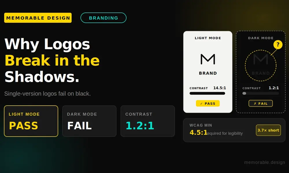
Most visual assets are created in a light-mode vacuum. Designers sit in bright rooms, staring at white artboards, pulling together deep corporate blues, rich charcoal grilles, or crisp black serifs.
When that identical asset is forced onto a modern dark gray or OLED black user interface, the physical laws of color contrast work against it. Dark elements completely disappear, thin geometry gets swallowed by bleeding pixels, and the careful visual hierarchy carefully crafted by the design team collapses.
Slapping a quick white box or an aggressive glowing border around a light-themed asset is a lazy fix that ruins your brand’s prestige. True digital readability requires planning for dark backgrounds from day one.
Technical Comparison: Light vs. Dark Interface Environments
To help visualize how design rules shift when the background flips from light to dark, review this structural breakdown of environmental contrast metrics.
| Design Element | Light Mode Baseline | Dark Mode Environment | Recommended Design Fix |
| Background Value | Pure White (#FFFFFF) or Light Gray | Deep Gray (#121212) or Jet Black | Use rich off-black to reduce eye strain |
| Typography Contrast | High contrast via dark values | High contrast via light values | Thicken light typography weights slightly |
| Color Perception | Saturated colors look crisp | Saturated colors vibrate intensely | Desaturate vibrant hues by 10% to 15% |
| Shadow Utility | Dropshadows create clean depth | Dropshadows are completely invisible | Use inner glows or ambient light borders |
Three Methods for a Flawless Logo Dark Mode Version
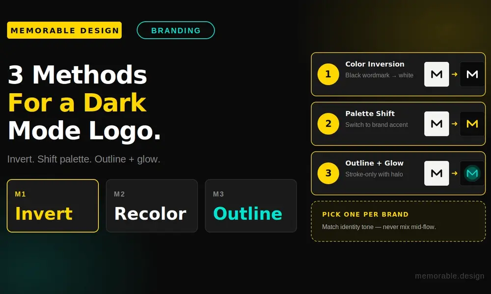
Fixing a visibility issue requires evaluating your current asset geometry and color palette. Depending on your brand complexity, you can execute a professional logo dark mode version using three primary creative techniques.
1. Simple Color Inversion
For minimalist, single-color marks or pure typographic text wordmarks, the easiest fix is direct value inversion. Anything that was solid black or dark gray in light mode flips to pure white or a soft, accessible metallic silver in dark environments.
This keeps the exact scale and geometry intact while ensuring maximum contrast against dark backgrounds. It works beautifully for tech startups, luxury fashion brands, and simple editorial platforms that rely heavily on clean typography.
2. Multi-Color Palette Shifts
If your brand asset uses a complex combination of shapes and gradients, simple inversion will look strange and clip your imagery. In these cases, you need to create a dedicated dark-themed color palette.
This involves isolating elements that bleed into the dark background and swapping them out for lighter, complementary tones. For instance, a navy blue shape might shift to a vibrant sky blue, while a deep forest green transforms into a bright mint accent. The goal is to preserve the psychological mood of your brand identity without sacrificing legibility.
3. Structural Linework Adjustments
Sometimes, changing colors isn't enough to save a complex mark. When a brand features intricate linework or delicate negative space, the bright light from surrounding pixels can cause an optical illusion that makes fine lines look even thinner.
To fix this, you need to adjust the actual vector anchors. This might mean adding a subtle, high-contrast outer stroke to the asset, path-expanding thin lines to make them bolder, or filling in specific negative spaces so the overall shape stays clear and recognizable at smaller sizes.
Implementing a Fluid Responsive Logo Design
An adaptive design doesn't just change colors based on light or dark modes; it also responds dynamically to screen sizes and device constraints. True responsive logo design blends context-aware layout shifts with theme-appropriate styling to create a seamless visual experience.
[Adaptive System Blueprint]
Desktop /To build a truly bulletproof system, your design files should be exported as clean, lightweight Scalable Vector Graphics (SVGs). Unlike flat, static PNG image blocks, SVGs allow developers to embed targeted CSS media queries directly inside the graphic code itself.
By writing a simple prefers-color-scheme: dark rule directly into the asset code, the logo can swap its own internal stroke values, fill colors, and opacity layers automatically. This eliminates the need to load multiple heavy image files, keeping your website lightning-fast while ensuring your brand looks incredibly sharp on every device.
Golden Rules for Adaptive Brand Assets
Building a flexible identity system requires a disciplined approach to your brand guidelines. If you want your visual assets to look modern and professional across all applications, keep these core design principles in mind:
- Test Against Variable Background Gradients: Do not just test your dark asset against pure black. Make sure it looks legible against dark slate, deep navy, and midnight blue tones to account for different app interfaces.
- Keep an Eye on Color Vibrancy: Highly saturated colors can look blindingly bright on dark screens. If your corporate colors cause eye strain, create a slightly desaturated, softer tone for dark mode use.
- Maintain Visual Hierarchy: Ensure that the most important part of your logo stands out first, regardless of the background color. The primary icon should always command attention before secondary text elements.
- Simplify the Geometry Early: The cleaner your shapes are from the start, the easier they will adapt to different screen styles, small mobile screens, and theme shifts down the road.
Conclusion: Future-Proofing Your Brand Identity
The digital world is no longer fixed on a white background. As more users adopt dark interfaces to save battery life and reduce eye strain, your brand assets have to evolve to stay visible. A static logo that works only in light mode will inevitably fade into the background.
By embracing a flexible adaptive logo system, you ensure your business keeps its premium look on every smartphone, desktop app, and web page. Investing time into a high-quality dark mode logo design protects your brand equity and delivers a polished, professional user experience. If you are ready to future-proof your digital presence, reach out to the team at Memorable Design to build a modern, responsive identity system that looks stunning in any environment.
Frequently Asked Questions (FAQs)
What exactly is an adaptive logo system?
An adaptive logo system is a modern design framework where a brand identity uses multiple, slightly altered vector variations of its logo. The system automatically displays the most legible version based on the user's screen size, device orientation, or light/dark interface settings.
Why do logos break when users switch to dark mode?
Logos typically break because they were originally designed on a light background. When the screen flips to dark mode, dark text and delicate icon elements lose their contrast against the dark gray or black background, making the brand asset look muddy or invisible.
Should I just put a white stroke around my light logo for dark mode?
Adding a crude white stroke or a glowing drop shadow is generally considered a sloppy, unpolished fix. It alters the original silhouette of your brandmark and can look cheap. It is much better to create a clean, dedicated dark mode asset with adjusted colors and optimized vector paths.
How do developers automate logo changes between light and dark themes?
Developers use SVGs with embedded CSS media queries like @media (prefers-color-scheme: dark). This code tells the browser to automatically change color fills, strokes, or swap entire graphics the exact moment a user changes their operating system preferences.
