

Key Takeways
- Settings pages often degrade into “digital junk drawers” without intentional structure
- Poor configuration design is a major driver of B2B user churn and support tickets
- Strong SaaS settings use clear grouping (identity, billing, system, etc.)
- Answer: progressive disclosure + hierarchy + search reduce cognitive overload
- Mobile-first settings UX requires simplified, drill-down navigation patterns
- Successful redesigns depend on careful transition (tours, legacy toggle, user guidance)
Every product manager loves building shiny new features, but few enjoy deciding where their configuration toggles live. Over time, as a software platform grows, its configuration layout slowly degrades into a chaotic mess of disconnected options. This slow structural decay turns what should be a straightforward workspace into an absolute digital junk drawer. Studying elite saas settings page examples reveals that a great configuration portal is not a dumping ground for miscellaneous code toggles. It is a highly structured, intuitive dashboard that directly empowers users to customize their workspace without experiencing cognitive overload.
Fixing a cluttered configuration layout requires moving far beyond generic layout patterns. It demands a deep, systemic clean-up of your software’s underlying navigation pathways, interactive toggles, and contextual help snippets. Based on available data, an estimated 70% of user churn in complex business software is triggered by configuration frustration rather than missing features. Implementing a clean settings page ux strategy ensures that non-technical users can quickly manage complex permissions, update billing profiles, and modify operational preferences without filing support tickets.
When configuration layouts are neglected, user adoption rates rapidly drop. Our product strategy and user experience team at Memorable Design will break down the exact design choices that transform cluttered software tools into highly organized, intuitive digital workspaces. We will outline the structural principles required to master your interface layout and build a premium, scalable configuration ecosystem.
The article explains how poorly designed SaaS settings pages turn into “digital junk drawers” that frustrate users and increase churn. It highlights structured information architecture, clear navigation, and search-first design as essential fixes. Key principles include grouping settings logically, improving UX clarity, optimizing mobile layouts, and using progressive disclosure and safe, intuitive configuration patterns.
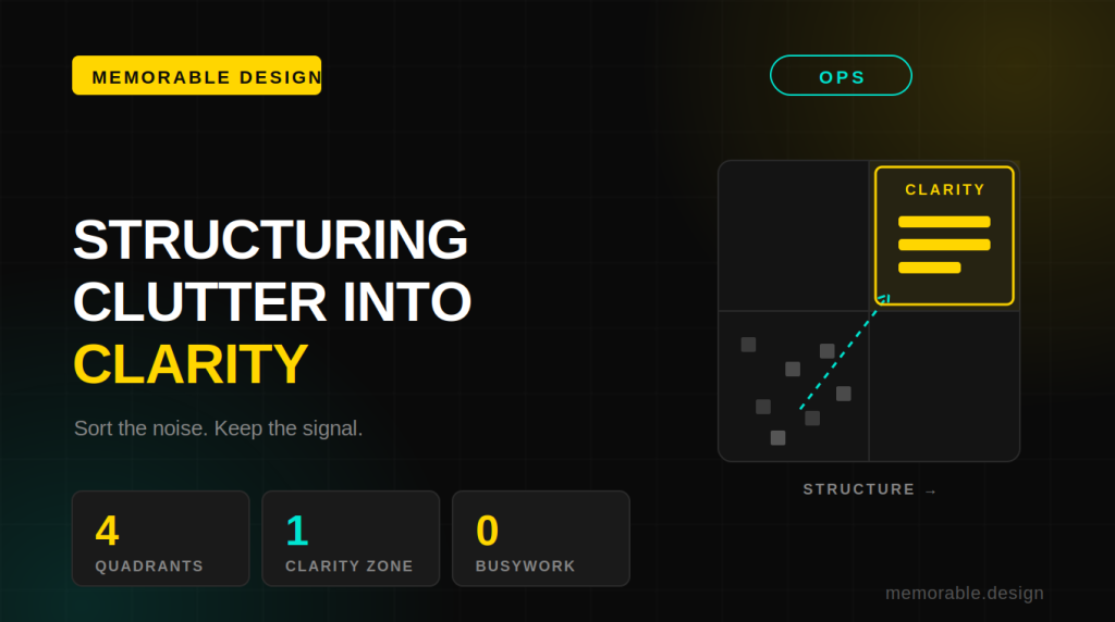
The Operational Matrix: Structuring Clutter vs. Clarity'
To build a configuration experience that easily scales alongside your product, your interface must treat distinct data categories differently. The table below displays an optimal configuration structural blueprint, contrasting intuitive design traits with common clutter pitfalls.
| Configuration Category | Elite Settings Information Architecture | Common Clutter Pitfall | Ideal Settings Page Navigation |
| Identity & Access | Grouped by user profile, login security, and API tokens | Scattered across mixed utility tabs | Fixed top-level sidebar category |
| Financial Operations | Centralized billing tiers, receipt history, and card details | Hidden inside generic workspace parameters | Dedicated standalone billing module |
| System Automation | Rules categorized by triggered events and target channels | Stuffed into a single, massive scroll view | Multi-step tabular layouts |
Phase 1: Overcoming the Digital Junk Drawer Syndrome
The primary reason software configuration layouts become cluttered is a total lack of long-term planning. When a engineering team launches a minor product addition, they often toss its control toggle into whatever tab has the most empty space.
[New Feature Built] ➔ [Toggle Added to Random Tab] ➔ [Cognitive Load Increases]
This haphazard approach permanently breaks your settings information architecture, forcing your clients to hunt through dozens of unrelated menus just to adjust a basic automation rule.
To prevent this structural decay, your design team must treat your configuration portal as an independent, living ecosystem. Reviewing top-tier saas settings page examples highlights the immense value of using explicit visual groupings, progressive disclosure interfaces, and smart defaults.
At Memorable Design, we always advise product teams to run strict card-sorting exercises with real users before writing a single line of frontend code. This practice ensures your layout categorization perfectly matches your customer's natural mental model rather than your internal engineering database structure.
Phase 2: Mastering the Mechanics of Layout Navigation
Once your configuration categories are clearly mapped out, your primary design challenge shifts to building intuitive navigation pathways. A massive, single-page wall of toggles will instantly overwhelm an executive trying to make a quick system change.
Designing a Clean Account Settings UI Design
An exceptional account settings ui design relies heavily on clean visual hierarchy, generous white space, and clear structural separation. Avoid the temptation to use highly decorative, non-standard navigation menus that force users to relearn basic interface interactions.
Instead, utilize a highly predictable vertical sidebar layout paired with sticky, top-level section headers. This clean approach ensures that no matter how deep a client explores their workspace preferences, they always retain an absolute sense of spatial orientation within your platform.
Refining Your Preferences UI Pattern
When a user needs to adjust advanced notification rules or security thresholds, your preferences ui pattern must make those changes feel entirely safe and reversible. Use clear, descriptive inline microcopy directly beneath every toggle to explain exactly what changing that option does.
Furthermore, always include real-time validation badges and immediate visual confirmation states. When a platform clearly indicates that an update was saved successfully, it eliminates user anxiety and drastically reduces unnecessary customer support interactions.
Phase 3: Optimizing the Cross-Platform Configuration Experience
As modern business workflows become increasingly mobile, your configuration layout must translate seamlessly across vastly different screen sizes. A multi-column desktop layout will completely break when compressed into a standard smartphone viewport.
Perfecting Mobile Settings UX Real Estate
Building a responsive mobile settings ux demands a radical commitment to structural simplification and touch-friendly interactive elements. Avoid using dense dropdown menus or tiny radio buttons that are nearly impossible to click accurately on a mobile screen.
Convert your desktop sidebar menus into clean, full-screen drill-down lists that leverage familiar native mobile patterns. By utilizing large touch targets and sticky bottom actions, you ensure that administrators can safely manage critical company settings while working on the go.
Implementing Account UI Best Practices
An elite account ui best practices strategy requires embedding a powerful, fuzzy-search bar directly at the top of your main configuration portal. When an administrator is trying to locate a deeply nested webhook toggle, typing a single keyword should surface the exact setting instantly.
Additionally, always group highly sensitive actions—such as deleting an entire workspace or exporting sensitive customer databases—into a dedicated, visually distinct danger zone. Requiring explicit password re-verification prevents accidental data loss and reinforces long-term system trust.
Phase 4: Executing a Seamless Configuration Interface Relaunch
When your product team finally decides to deploy a comprehensive settings page redesign, how you introduce those structural changes to your existing user base will completely dictate the success of the update.
Forcing a massive layout overhaul on long-term power users without giving them any advance warning will inevitably spark intense user frustration. Even if your new settings page navigation is objectively vastly superior to your old layout, users will initially miss the familiar muscle memory they built over several years.
To mitigate this friction, launch your updated layout alongside an interactive, step-by-step in-app tour that clearly highlights where key options now live. At Memorable Design, we highly recommend keeping a temporary legacy toggle active for a brief window. This thoughtful transition strategy gives your enterprise clients plenty of time to update their internal training documentation and adjust to the new workflow at their own comfortable pace.
Frequently Asked Questions About SaaS Settings Design
What defines the absolute best saas settings page examples in the current B2B market?
The absolute best saas settings page examples belong to platforms like Notion, Slack, and Stripe. These elite products excel because they group complex configuration toggles into highly predictable categories, leverage real-time search functionality, and use elegant progressive disclosure to keep advanced developer options hidden from non-technical business users until they are explicitly needed.
How does a poor settings page ux directly hurt an enterprise software platform?
A chaotic, confusing settings page ux drastically increases customer onboarding friction, drives up customer support ticket volumes, and severely damages overall user adoption rates. When platform administrators constantly struggle to perform basic tasks like adding new team members or updating billing cards, they quickly conclude that the entire tool is far too difficult to maintain over the long run.
What are the main warning signs that a product needs a complete settings page redesign?
The most common indicators that your platform desperately needs a settings page redesign include a massive spike in customer support tickets explicitly asking how to locate specific menus, a complete lack of configuration search functionality, a high volume of accidental workspace deletions, and an interface that completely breaks when viewed on a standard mobile device.
How can a product team balance desktop utility with mobile settings ux requirements?
Achieving great cross-platform balance requires using a highly modular, component-based design system. Ensure that your settings page navigation can easily transition from a multi-column sidebar layout on large desktop monitors into a single-column, tap-to-expand list on smaller mobile screens, keeping the underlying content hierarchy completely identical across all devices.
Conclusion: Engineering an Elite Configuration Workspace
Transforming your platform's configuration portal from a cluttered junk drawer into a highly organized strategic asset requires relentless design discipline and structural clarity. As the actionable interface breakdowns throughout our guide on saas settings page examples clearly show, a world-class user experience is never an accident. It is the direct mathematical result of respecting user psychology and building intuitive, scalable navigation pathways from day one.
By implementing a rigorous, predictable approach to your settings information architecture, utilizing powerful search tools, and establishing clear safety guardrails around sensitive actions, you create a software environment that users genuinely love configuring. Do not allow an uninspiring, disorganized configuration layout to quietly undermine your development team's incredible hard work. Build a polished, high-performing interface layout using our strategic framework at Memorable Design, and discover how simple it is to turn complex technical administration into an absolute breeze today.
0 Comments