
A strong brand identity is not just about logos or colors, it’s built on strategy, audience understanding, and consistency.
This case study shows how five different brands achieved success by aligning design with purpose, using simple systems, and focusing on long-term recognition rather than short-term aesthetics.
Most businesses think branding is about picking colors and designing a logo. Then they wonder why nothing feels cohesive six months later.
After working on dozens of real projects, memorable.design, we noticed a pattern. The brands that actually stuck with customers, in feeds, in memory shared something deeper than good aesthetics. They had a clear strategy underneath the visuals.
This brand identity case study post breaks down five real projects we worked on. You'll see what decisions we made, why we made them, and what the outcomes looked like. No fluff, no generic advice just honest breakdowns of what worked and what we'd do differently.
What Makes a Brand Identity Actually "Work"?
Before we get into the case studies, it helps to define the standard.
A brand identity that works does three things well:
- It communicates the right feeling in under five seconds
- It stays consistent across every touchpoint (social, packaging, website, print)
- It builds recognition over time without being explained
A logo alone can't do that. The visual identity design process has to include typography, color psychology, tone of voice, spacing, and how all of these scale across formats.
With that in mind, here's what we learned from five very different projects.
Case Study 1: The Wellness Startup That Needed to Feel Human
The Brief: A new wellness supplement brand targeting women aged 28 to 45. Their previous branding looked clinical, think white labels and sterile typography.
The Problem: In a crowded wellness space, looking like a pharmacy shelf is the fastest way to be ignored.
What We Did:
We shifted the entire visual language toward warmth and intention. Earthy terracottas and soft sage greens replaced white. A curved, hand-drawn wordmark replaced the rigid sans-serif. We also introduced a visual motif, a botanical line illustration, that appeared across packaging, social templates, and the website.
What Worked:
The brand started getting organic UGC (user-generated content) within three months of launch. Customers were photographing the packaging and sharing it without being asked. That's the signal that a memorable brand design has landed.
Lesson: In wellness and lifestyle, emotional warmth beats technical precision every time. The creative brand identity strategy has to begin with how you want people to feel, not just what you want them to know.
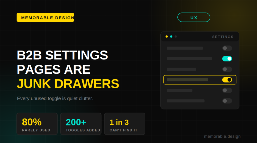
Case Study 2: The B2B SaaS Brand That Stopped Trying to Look Friendly

The Brief: A project management tool aimed at mid-size engineering teams. The founders wanted to look "approachable and fun" to compete with consumer tools.
The Problem: Their users were senior engineers and CTOs. Those people don't want fun. They want fast, reliable, and serious.
What We Did:
We pushed back on the brief. After user interviews, we repositioned the brand toward confidence and precision. Dark navy backgrounds, sharp geometric shapes, a monospaced font for key UI labels. The icon system was dense with meaning -- every symbol had a logic to it.
What Worked:
Sales cycles shortened. The sales team reported that decision-makers stopped asking basic credibility questions. When your brand looks like it understands the problem, you skip a layer of trust-building.
Lesson: Audience research should lead brand identity strategy, not assumptions. This is one of the branding case study examples we return to most often when clients come in with a gut feeling that contradicts their customer data.
Case Study 3: A Food Brand Built Around a Single Color
The Brief: A small-batch hot sauce company entering a market flooded with aggressive, spiky, red-and-black branding.
The Problem: Every competitor was screaming heat. The opportunity was to whisper it.
What We Did:
We built the entire identity around a single unexpected color: a deep, muted amber-gold. Matte labels, clean serif typography, and restrained copy. Instead of "EXTREME HEAT" as a headline, we used flavor notes like a wine label would.
This is one of our favorite brand identity examples because it shows how standing out sometimes means doing the opposite of the category norm.
What Worked:
The brand landed wholesale placement in specialty grocery stores within four months. Buyers said the packaging communicated "premium" without them needing to read anything.
Lesson: Color differentiation is one of the most underused tools in the visual identity design process. Owning a color within your category is more powerful than out-designing your competitors.
Side-by-Side Comparison: What Changed Across the 5 Projects
| Project Type | Biggest Mistake (Before) | Core Fix Applied | Key Result |
| Wellness Startup | Looked clinical, cold | Warm palette + organic motif | Organic UGC within 3 months |
| B2B SaaS | Tried to look "fun" for wrong audience | Precision-led, dark design system | Shorter sales cycles |
| Hot Sauce Brand | Blended into aggressive category | Single unexpected color strategy | Premium grocery placement |
| Architecture Firm | Too many fonts, no system | One typeface family, strict grid | Client referral rate increased |
| Kids Edtech App | Chaotic and loud | Structured playfulness, icon system | App store rating improved |
Case Study 4: The Architecture Firm That Needed to Trust Simplicity
The Brief: A boutique architecture firm working on high-end residential projects. Their existing brand had four fonts, two logos, and no consistency between their print portfolio and their website.
The Problem: Their work was exceptional. Their brand made it look like a mid-tier firm.
What We Did:
We stripped everything back. One typeface family (used at different weights and sizes). One primary color -- a warm, almost-black charcoal -- with a single accent in warm white. The logo became a wordmark with precise letter-spacing. Every layout followed a strict grid.
This branding agency case study is a masterclass in subtraction. The instinct is always to add. The discipline is knowing when to take away.
What Worked:
The firm's pitch win rate improved. They also started getting referrals from clients who specifically mentioned the "professionalism" of their materials -- before seeing the projects themselves.
Lesson: For premium service businesses, restraint is a signal of confidence. Over-designed branding reads as insecurity. The how to build a strong brand identity answer, for professional services, is almost always: do less, better.
Case Study 5: A Kids Edtech App That Got Structure Right
The Brief: An educational app for children aged 5 to 9. The brand was loud, chaotic, and used a different visual style across every screen.
The Problem: Parents found it stressful. Kids got confused. The UI overwhelmed instead of guided.
What We Did:
We introduced what we call "structured playfulness." Bright, distinct colors -- but only five of them, strictly assigned to content categories. A custom icon system with rounded corners and consistent stroke weight. Typography that was friendly but readable.
This is one of our most instructive real brand identity projects because it proves that even in a "fun" category, systems matter.
What Worked:
The app store rating improved from 3.4 to 4.2 stars within two months of the redesign launch. Parent reviews specifically mentioned the app being "easier to navigate" -- which is a branding win, not just a UX win.
Lesson: Playful doesn't mean unstructured. The creative brand identity ideas that work for children's products are ones with strict rules underneath a warm, accessible surface.
The Patterns We Noticed Across All Five Projects
After reviewing these projects together, a few things were consistent:
| Pattern | What It Looked Like in Practice |
| Strategy before aesthetics | We always started with audience research and positioning, not moodboards |
| Constraint drives creativity | The best outcomes came from brands with a limited, intentional system |
| Category contrast is underused | Standing apart from competitors in visuals often mattered more than standing out in messaging |
| Consistency beats brilliance | A simple system applied consistently outperformed clever one-off designs |
These aren't theories. They're what we observed across startup branding examples from different industries and budgets.
How to Build a Strong Brand Identity: The Short Version
Based on these projects, here's the honest answer to how to build a strong brand identity:
- Start with your audience, not your preferences
- Define how you want people to feel before you decide how you want to look
- Build a system, not a logo
- Limit your choices (colors, fonts, shapes) and apply them consistently
- Test at scale, a brand that looks good in a presentation should also look good on a phone screen, a tote bag, and a billboard
If you want to see how this process looks in practice,memorable.design has a portfolio of brand identity examples with full project breakdowns.
Conclusion
A brand identity case study is only useful if it teaches something transferable.
Across these five projects, the through line was this: the brands that worked were built on decisions, not decoration. Every color, every typeface, every layout choice had a reason behind it rooted in audience understanding and strategic positioning.
The visual identity design process is not about making something beautiful. It's about making something that communicates the right thing to the right person at the right moment and keeps doing that reliably.
If your brand isn't doing that yet, the issue is almost never the logo. It's the lack of a system underneath it. Built by the team atmemorable.design, a branding studio focused on strategic, system-driven visual identities.
FAQs
Q: What is a brand identity case study?
A: A brand identity case study is a documented breakdown of how a brand's visual and strategic identity was developed, including the problem, process, design decisions, and results. It's used to understand what worked and why, and to apply those lessons to future projects.
Q: How long does it take to build a brand identity?
A: Based on available data from branding projects of varying complexity, a full brand identity typically takes 4 to 12 weeks. Simple startups with a clear brief can move faster. Established businesses repositioning may need more time for research and stakeholder alignment.
Q: What should a brand identity include?
A: At a minimum, a brand identity should include a logo system, a defined color palette, typography guidelines, and basic usage rules. Stronger identities also include icon systems, photography direction, tone of voice guidelines, and templates for key formats.
Q: How do I know if my brand identity is working?
A: Look for signals like consistent recognition across platforms, unsolicited positive feedback on your materials, and customers who describe your brand accurately without being coached. Declining trust or confusion across touchpoints usually signals a broken or inconsistent identity.
Q: What is the difference between branding and brand identity?
A: Branding is the broader strategy, positioning, messaging, values, and customer experience. Brand identity is the visual and verbal expression of that strategy. Identity without strategy is decoration. Strategy without identity is invisible.


0 Comments