
The article explores hidden symbols in famous logos, showing how designers use negative space and clever imagery to communicate brand values. It highlights examples like FedEx's arrow, Amazon's smile-to-A to Z, and Tostitos' snack-sharing symbol. These subtle design choices enhance brand recall, loyalty, and storytelling, turning logos into powerful visual narratives that resonate deeply with consumers.
Have you ever looked at a brand mark you’ve seen a thousand times, only to suddenly realize there is a secret image staring back at you? Great design isn't just about looking good; it is about communicating on multiple levels simultaneously. The most successful brands in the world use hidden meanings in logos to tell a deeper story about their values, history, and mission without saying a single word. These "Easter eggs" create a sense of discovery and delight that builds a lasting psychological bond with the consumer.
In the world of high-end branding, a logo with hidden message is the ultimate mark of craftsmanship. By using clever techniques like negative space and gestalt principles, designers can pack a massive amount of information into a tiny, simple icon. At Memorable Design, we believe that these subtleties are what separate a generic symbol from an iconic masterpiece. Understanding these hidden meanings in logos allows us to see the intentionality behind the world's most famous brands, proving that in design, nothing is ever an accident.
Why Designers Use Hidden Symbols
Designers don't just add hidden symbols to be "sneaky." There is a calculated psychological reason for this approach. When a human brain "solves" a visual puzzle—like finding the arrow in the FedEx logo—it releases a small hit of dopamine. This positive reinforcement creates a "sticky" brand memory. Clever logo design transforms a passive viewer into an active participant.
Furthermore, logo symbolism examples often serve as a visual shorthand for a company's unique selling proposition. Whether it’s an arrow representing speed or a smile representing customer satisfaction, these symbols reinforce the brand promise every time they are seen. As we decode these iconic logo decoded stories, you’ll see how logo psychology meaning plays a pivotal role in consumer perception in 2026.
1. FedEx: The Ultimate Negative Space Arrow
The FedEx logo is perhaps the most famous example of logo negative space examples. If you look closely at the white space between the ‘E’ and the ‘x’, you will see a perfect right-pointing arrow.
This isn't just a fun trick; it represents the speed, direction, and precision of the delivery service. It is a masterclass in clever logo design because it remains invisible to many until it is pointed out, but once you see it, you can never unsee it. This is a primary reason why FedEx remains a top case study in secret meanings logos.
2. Amazon: More Than Just a Smile
Most people see the yellow arrow in the Amazon logo as a smile, indicating that the company wants its customers to be happy. While true, that is only half of the logo with hidden message.
Notice where the arrow starts and ends: it points from ‘a’ to ‘z’. This tells the story that Amazon sells everything you could possibly need, from the first letter of the alphabet to the last. This dual-layered logo symbolism examples helps establish Amazon as the "everything store" in the minds of global consumers.
3. Baskin-Robbins: The Magic Number 31
Baskin-Robbins is famous for its "31 flavors" concept—one for every day of the month. If you look at the pink parts of the ‘B’ and the ‘R’ in their logo, the number 31 is clearly visible.
This is a fantastic use of logo negative space examples that anchors the brand's core identity directly into its monogram. At Memorable Design, we often use similar techniques to ensure a brand's "Reason to Believe" is baked into its visual DNA.
4. Tostitos: A Shared Snack Experience
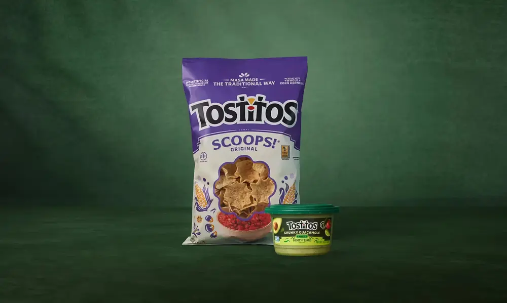
The Tostitos logo is a great example of logo psychology meaning. If you look at the two lowercase ‘t’s in the middle of the word, they look like two people. The dot on the ‘i’ is a bowl of salsa, and the people are holding a tortilla chip between them.
This creates an immediate emotional connection to the idea of social gathering and sharing. It tells the viewer that Tostitos isn't just a food; it's an event. These famous logo stories remind us that even the most mundane products can have deep emotional resonance through design.
5. Pinterest: Pinning the Identity
Pinterest is a digital pinboard, and its logo perfectly reflects that. The letter ‘P’ is actually shaped like a literal pushpin.
The sharp point at the bottom of the ‘P’ is a subtle nod to the physical action of pinning something to a corkboard. It’s a clever logo design that bridges the gap between the physical and digital worlds, making the app's function instantly intuitive to a new user.
6. Cisco: The Roots of San Francisco
Cisco was founded in San Francisco, and its logo pays homage to its birthplace. The blue vertical lines represent signal waves (fitting for a networking company), but they are also shaped like the Golden Gate Bridge.
This is a powerful iconic logo decoded moment because it shows how a tech giant can maintain a sense of place and local pride even as it scales globally. This use of logo symbolism examples builds trust by highlighting the brand's origins.
7. Toyota: Every Letter Included
The Toyota emblem is often mistaken for a cowboy wearing a hat, but it is much more complex. The three overlapping ovals represent the heart of the customer, the heart of the product, and the heart of technological progress.
However, the "designer's secret" here is that if you break down the strokes of the logo, you can actually spell out every letter of the word "TOYOTA." It is one of the most comprehensive hidden meanings in logos ever created, showing a level of detail that commands respect.
Logo Comparison: Concept vs. Hidden Symbol
| Brand | Visible Element | Hidden Symbol | Strategic Goal |
| FedEx | Typography | Arrow (Negative Space) | Convey Speed & Accuracy |
| Amazon | Smile | A to Z Path | Communicate Vast Inventory |
| Baskin-Robbins | Monogram | Number 31 | Highlight Product Variety |
| Cisco | Signal Lines | Golden Gate Bridge | Honor Brand Heritage |
| Toyota | Overlapping Ovals | Full Brand Name | Showcase Engineering Detail |
8. Beats by Dre: The Person in the Music
The Beats logo is a simple red circle with a lowercase ‘b’ inside it. To the casual observer, it’s just the brand’s initial. To a designer, it’s a person wearing headphones.
The red circle is a human head, and the ‘b’ is the headphone set. This logo psychology meaning places the user at the center of the brand. It tells the customer that the product is designed for their ears and their experience. It is a prime example of logo modernization done right.
9. NBC: The Colorful Peacock
The NBC logo features six different colored feathers. This dates back to the 1950s when NBC was owned by RCA, which was starting to sell color televisions.
The peacock was a logo with hidden message designed to show people what they were missing if they were still watching in black and white. Each feather represents a different division of the network. This is one of those famous logo stories that combines marketing history with clever visual metaphor.
10. Tour de France: The Hidden Cyclist
The Tour de France logo contains a hidden cyclist within the wordmark. The ‘o’, ‘u’, and ‘r’ of "Tour" form the wheels and body of a rider, with the yellow circle representing both the front wheel and the sun.
This is a brilliant iconic logo decoded example because it incorporates the energy and movement of the event into the text itself. It’s clever logo design that makes the static word feel fast and athletic.
11. Gillette: A Sharp Execution
Look closely at the ‘G’ and the ‘i’ in the Gillette logo. You’ll notice a razor-sharp diagonal cut across both letters.
This represents the sharpness and precision of the company's razors. It is a subtle way to reinforce the product's main benefit within the typography. At Memorable Design, we often find that these tiny "cuts" or adjustments can make a font feel entirely custom and proprietary.
12. Hyundai: More Than an "H"
Most people think the Hyundai logo is just a slanted version of the Honda logo. In reality, it has a much deeper logo psychology meaning.
The slanted ‘H’ is actually a stylized silhouette of two people shaking hands—representing the company and the customer. This logo symbolism examples emphasizes the brand's commitment to service, partnership, and trust, which are key components of E-E-A-T in 2026.
13. Adidas: The Mountain of Challenges
The three stripes in the Adidas logo have changed over the years, but they are currently slanted to resemble a mountain.
This secret meanings logos detail represents the obstacles that athletes must overcome to reach their peak performance. It aligns the brand with the "Hero's Journey," a powerful narrative in logo psychology meaning that inspires customers to push their limits.
14. Sony VAIO: The Analog and Digital Blend
The VAIO logo is a masterpiece of iconic logo decoded history. The first two letters, ‘V’ and ‘A’, are shaped like an analog wave. The last two letters, ‘I’ and ‘O’, represent the binary digits 1 and 0.
This logo tells the story of the transition from analog to digital technology. It is a high-level logo with hidden message that appeals to tech enthusiasts and engineers who appreciate the "Expertise" baked into the brand’s visual identity.
The Value of Logo Symbolism in 2026
As AI-driven search and visual recognition become the standard, hidden meanings in logos are more important than ever. A logo needs to be recognizable not just by humans, but by algorithms that look for specific geometric patterns.
- Brand Distinction: In a crowded market, clever logo design helps you stand out from generic competitors.
- Customer Loyalty: When a customer "discovers" a hidden meaning, they feel like they are "in on the secret," which increases brand affinity.
- Storytelling: A logo with hidden message allows you to tell your brand's story on social media and in marketing materials, providing "Authoritativeness" to your brand narrative.
- Versatility: Logo negative space examples often result in simpler designs that are easier to reproduce on everything from giant billboards to tiny app icons.
How to Decipher Logos Like a Professional
If you want to start finding secret meanings logos on your own, you need to change how you look at shapes. Designers often use a "gestalt" approach, which means looking at how parts of an image relate to the whole.
- Look at the Negative Space: Don't just look at the ink; look at the "holes" between the letters.
- Analyze the Slant: Is the logo leaning forward (progress) or standing straight (stability)?
- Count the Elements: Is there a specific number of lines or dots that might represent something in the company's history?
- Check for Wordplay: Like the Tour de France cyclist, sometimes the letters themselves are arranged to look like an object.
- Research the Founder: Often, famous logo stories are rooted in the personal interests or the birthplace of the person who started the company.
Summarizing the Power of Visual Secrets
A great logo is a silent salesman. It works 24/7 to communicate who you are and what you stand for. By incorporating hidden meanings in logos, brands can convey complex ideas like "A to Z" variety or "Speed and Precision" through simple visual cues.
At Memorable Design, we specialize in this type of intentional branding. We don't just pick pretty colors; we build layers of meaning into every mark. Whether it’s through logo negative space examples or deep logo psychology meaning, our goal is to ensure your brand leaves a lasting impression on your audience.
Conclusion
The world is full of visual stories waiting to be told. From the mountains of Adidas to the handshake of Hyundai, hidden meanings in logos prove that the best designs are the ones that keep on giving. These iconic logo decoded examples serve as an inspiration for any business looking to elevate their presence.
By focusing on logo symbolism examples and clever logo design, you can turn a simple graphic into a powerful narrative. As we've seen throughout these famous logo stories, the key is to be intentional with every line and every curve. If you want a brand that is truly unforgettable, look for the secrets hidden in plain sight. Let Memorable Design help you find your own hidden message today. Your brand deserves a logo with hidden message that tells the world exactly why you are the best at what you do. Reflecting on hidden meanings in logos isn't just a hobby for designers—it's a roadmap for building an iconic brand.
FAQs
Why do brands hide messages in their logos?
Brands use hidden meanings in logos to create a deeper connection with the audience. It makes the brand feel "clever" and rewarding to discover, which increases brand recall and loyalty.
What is the most famous logo with a hidden message?
The FedEx logo is widely considered the gold standard for logo negative space examples because of the perfectly formed arrow hidden between the ‘E’ and ‘x’.
How does logo psychology meaning affect my business?
Logo psychology meaning influences how customers feel about your brand on a subconscious level. For example, rounded shapes feel more welcoming and "Trustworthy," while sharp angles feel more "Expert" and precise.
What are some common logo symbolism examples?
Common symbols include arrows (progress/speed), trees (growth/sustainability), and circles (community/unity). Secret meanings logos often take these common symbols and hide them in unexpected places.
Can Memorable Design help me create a logo with a hidden meaning?
Absolutely. At Memorable Design, we pride ourselves on creating clever logo design that incorporates your brand's unique story and values into a timeless, iconic mark that works for 2026 and beyond.


0 Comments