
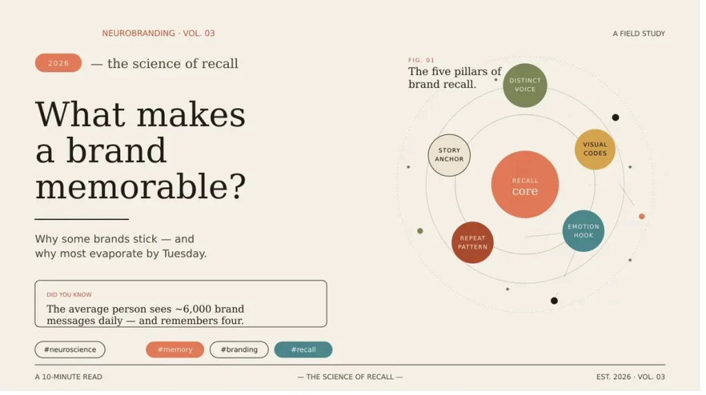
Most brands fail at recall because they prioritize aesthetics over memory. Effective brand recall design relies on simplicity, distinctiveness, and consistency, not trend-following or complexity. When brands lack a single ownable visual element or emotional connection, they fade into category sameness. Memorability comes from clear, repeated visuals that the brain can easily process and retain.
That is the real problem with modern brand design. Companies pour budgets into visuals, hire talented designers, and launch polished identities, and then wonder why nobody remembers them a week later. The issue is not the execution. It is the thinking behind it.
Brand recall design is not about looking good. It is about being impossible to forget. And most brands, even well-funded ones, are getting this completely wrong.
This post breaks down exactly why brand designs fail to create recall, what the psychology actually says, and what memorabledesign.com has observed as the real difference between brands people remember and brands people scroll past.
The Core Problem: Design That Impresses but Does Not Stick
There is a fundamental confusion in the branding industry between design that wins awards and design that creates memory.
Award-winning design tends to be clever, layered, and appreciated by other designers. Memorable design tends to be simple, distinctive, and processed effortlessly by a distracted human brain. These are not always the same thing.
Most brand designers are trained to create work that is visually impressive. Very few are trained to create work that is neurologically sticky. That gap is where brand recall design breaks down.
What Brain Science Actually Says About Visual Memory
To understand why most brand designs fail, you need to understand how human memory actually works.
The Brain Does Not Save Everything
The human brain processes roughly 11 million bits of information per second. It consciously registers about 50. Everything else is filtered out.
For a brand visual to create recall, it needs to pass through two stages. First, it needs to get noticed at all, which requires being distinct from the surrounding visual noise. Second, it needs to be encoded into memory, which requires repetition, emotional connection, or strong pattern recognition.
Most brand designs fail at both stages.
The Role of Visual Identity Psychology
Visual identity psychology studies how visual elements, such as color, shape, typography, and composition, affect perception, emotion, and memory.
Here is what the research consistently shows:
Simple shapes are processed faster and remembered longer than complex ones. Color increases brand recognition by up to 80 percent according to widely cited research in the field. Faces and human elements trigger stronger emotional engagement than abstract graphics. Consistent repetition across touchpoints strengthens memory encoding over time.
The problem is that many brands apply these principles selectively or inconsistently, which prevents the cumulative memory effect from ever building up.
The 5 Reasons Brand Designs Fail at Recall
1. They Chase Trends Instead of Building Distinctiveness
Look at the logos of ten major tech startups from the last five years. Many of them share the same sans-serif wordmark, the same muted color palette, and the same geometric simplicity. They are all following the same trend.
Trend-following produces sameness. Sameness is the enemy of memorability in branding.
When your brand looks like every other brand in your category, the brain has no reason to store it separately. It gets merged into a category blur. You become "one of those" rather than "that one."
Distinctive brands break category conventions deliberately. They choose visual elements that are unusual enough to stand out in their context without being so strange that they alienate the audience.
2. They Prioritize Complexity Over Clarity
Many brand identities are visually rich in ways that feel impressive on a presentation slide but fall apart in real-world usage.
Intricate logo marks that lose detail at small sizes. Color systems with twelve brand colors that confuse rather than guide. Typography combinations that require too much cognitive effort to read.
When the brain has to work hard to process a visual, it tends not to remember it well. Cognitive ease, the feeling of effortless processing, is directly linked to familiarity and memory. Brand recall design requires reducing friction, not adding it.
3. The Identity Lacks a Single Ownable Element
The most memorable brands in the world own one specific visual element so thoroughly that the element becomes synonymous with the brand itself.
Think of Coca-Cola's red. Think of the Nike swoosh. Think of Apple's bitten apple. Think of Tiffany's specific shade of blue.
Each of these is a single, ownable, consistent element that the brand has committed to for decades. Repetition at scale turned these elements into memory triggers.
Most brand designs try to be remembered for everything, which means they end up being remembered for nothing. Visual identity psychology is clear on this: the brain responds to anchors. Give it one strong visual anchor and repeat it relentlessly.
4. Inconsistency Across Touchpoints Breaks the Memory Loop
Brand recall is not built in a single impression. It is built through repeated, consistent exposure over time.
This is where many brands silently fail. The logo on the website looks slightly different from the one on the packaging. The colors on social media drift from the official brand palette. The tone of the visual language shifts depending on who created the asset that week.
Each inconsistency interrupts the memory loop. Instead of reinforcing the same mental impression, each touchpoint creates a slightly different one. The cumulative effect is diluted recall rather than strengthened recognition.
Memorability in branding is fundamentally a consistency game. A simpler identity applied with complete consistency will outperform a sophisticated identity applied loosely every single time.
5. They Ignore the Emotional Layer
Memory and emotion are deeply connected in the brain. Experiences that carry emotional weight are encoded more strongly than neutral ones.
Most brand designs are emotionally neutral. They are professional, clean, and safe. They are designed not to offend, which also means they are designed not to move anyone.
Brands that create strong recall almost always carry an emotional signature. This does not mean they use dramatic imagery or sentimental messaging. It means the visual identity communicates something that resonates with the audience's identity, values, or aspirations.
That emotional resonance is what turns a visual into a feeling. And feelings are far more memorable than visuals alone.
What Memorable Brand Design Actually Looks Like
Understanding the failures is useful. Understanding what works is more useful.
The Simplicity Principle
The most recalled brand identities are almost always deceptively simple. They appear easy to copy but are actually the result of disciplined reduction, removing everything that is not essential until only the most powerful elements remain.
Simplicity does not mean generic. It means essential. There is a significant difference.
A brand can be simple and completely distinctive at the same time. The goal is to find the simplest possible expression of something that is genuinely unique to the brand.
Repetition as a Design Strategy
Brand recall design treats repetition not as a limitation but as a strategy.
When the same visual element appears consistently across every brand touchpoint, in the same color, the same proportion, the same context, the brain begins to associate that element with the brand automatically. This is how visual identity psychology works in practice.
Over time, the element becomes a trigger. Seeing it activates the brand memory without any additional context needed. That is the goal.
Category Contrast
One of the most underused tools in memorability in branding is deliberate contrast with category norms.
Identify what every brand in your category does visually. Then make a deliberate choice about where to break that pattern.
A financial services brand that uses warm, hand-drawn illustration in a category dominated by cold, corporate photography will be remembered. A food brand that uses stark, minimal design in a category dominated by warm, saturated imagery will stand out. The contrast itself does a significant part of the memory work.
A Simple Recall Audit for Your Brand
If you want to test how well your current brand design is built for recall, ask these questions honestly.
Can someone who saw your logo once sketch it from memory a week later? Does your brand own one visual element so consistently that it is instantly associated with you? Is your visual identity applied identically across every single touchpoint? Does your brand look meaningfully different from the leading competitors in your category? Does your visual identity carry an emotional quality that connects with your audience's identity?
If the answer to most of these is no, your brand design is likely producing impressions without producing memory.
Conclusion
The brands people remember did not get lucky. They made deliberate choices rooted in how human memory actually works.
Brand recall design is not about being the most beautiful brand in the room. It is about being the most impossible-to-forget brand in the room. That requires simplicity, distinctiveness, emotional resonance, and above all, relentless consistency.
Visual identity psychology gives us the framework. The principles are well established. What most brands lack is not knowledge but the discipline to apply that knowledge without compromise.
If your brand is visually impressive but forgettable, the problem is not your designer's skill. It is the brief they were given and the principles behind it.
Memorability in branding is a choice. Most brands just are not choosing it.
For more practical breakdowns on brand design, recall, and visual identity, visit memorabledesign.com.
Frequently Asked Questions (FAQs)
Q1: What is brand recall design?
Brand recall design is the practice of creating visual identities that are specifically built to be remembered by audiences, using principles from psychology, neuroscience, and visual communication.
Q2: Why do most brand designs fail to create recall?
Most brand designs fail because they prioritize visual appeal over memorability, follow category trends, lack consistency across touchpoints, or miss the emotional connection that drives memory encoding.
Q3: What makes a brand visually memorable?
Simplicity, a single ownable visual element, consistent repetition across all touchpoints, emotional resonance, and clear contrast with category competitors are the primary drivers of visual memorability.
Q4: How does visual identity psychology affect branding?
Visual identity psychology explains how colors, shapes, typography, and composition affect how people feel and what they remember. Brands that apply these principles deliberately tend to build stronger recall over time.
Q5: How can I improve memorability in branding for my business?
Start by simplifying your visual identity to one or two core ownable elements, apply them with complete consistency everywhere, and make sure your brand looks and feels distinctly different from competitors in your category.


0 Comments