
Agency owners and search professionals know the routine all too well. You spend weeks building links, fixing technical crawl errors, and writing great content. When it is time to report your wins, you send over a dense, 20 page PDF document filled with raw technical data.
Then your client emails you asking if the campaign is working.
The problem is not your performance. The problem is your reporting style. To solve this, you need seo dashboard examples that translate raw metrics into the language of business growth. Clients do not want to parse hundreds of rows of keywords or struggle with confusing charts. They want to see exactly how your search strategy affects their bottom line.
A great report bridges the gap between technical execution and business value. This guide shares the exact marketing dashboards and reporting dashboards that keep clients happy, retain accounts longer, and prove your return on investment.
The Secret to Client Friendly Marketing Dashboards
Most clients do not live in search tools all day. When they look at reporting dashboards, their eyes glaze over at terms like canonical tags, server responses, or keyword distribution.
Based on available data from long term digital campaigns, clients usually care about three simple things:
-
Are we getting more visibility on search engines?
-
Is that visibility bringing the right people to our website?
-
How many of those people are turning into paying customers?
The best seo dashboard examples focus on these core questions. They put big business wins at the top and relegate secondary technical metrics to lower sections. To build true trust, your reports must balance high level results with just enough supporting detail to prove your strategy works.
3 SEO Dashboard Examples Built for Client Clarity
Different clients have different priorities. A venture backed startup founder cares about rapid growth, while a local service business owner looks at phone calls and lead forms. Studying distinct seo dashboard examples helps you customize your delivery for every unique stakeholder.
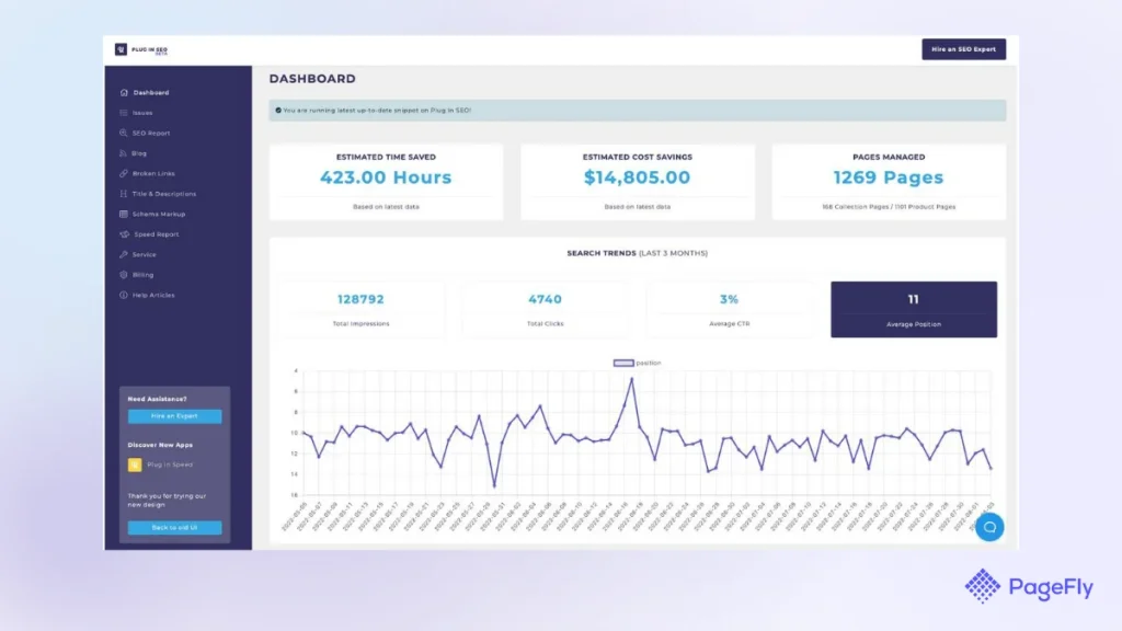
The following three framework examples show how to structure your data so it makes perfect sense to your audience.
1. The Executive Summary Dashboard
This framework is built for busy stakeholders who only have two minutes to review your progress each month. It stands as one of the most effective seo dashboard examples for reducing client churn.
What to place at the top:
-
Total Organic Conversions: The exact number of sales, signups, or leads generated by search.
-
Organic Revenue: The estimated financial value of those conversions.
-
ROI Progress: A simple comparison showing what they spent versus what they earned.
What to place in the middle:
-
Organic Traffic Trends: A clean line chart showing visitor growth over the last 12 months.
-
Top Landing Pages by Revenue: A short list showing which specific pages generate the most money.
Why clients understand it:
It speaks the language of corporate growth. It proves that search optimization is a revenue generator rather than an agency expense.
2. The Search Visibility and Traffic Performance Dashboard
This layout works perfectly for marketing managers who need to report details up to their directors. It connects your daily tasks to clear growth trends. When reviewing standard seo dashboard examples, you will notice this style centers entirely on top-of-funnel momentum.
What to place at the top:
-
Total Organic Impressions: How often the brand shows up in search results.
-
Organic Clicks: How many users clicked through to the website.
-
Average Click Through Rate: The efficiency of your page titles and snippets.
What to place in the middle:
-
Non Brand Traffic Performance: Visitors who found the site without typing the exact company name. This proves you are winning new business.
-
Device Split: A simple pie chart showing mobile versus desktop visitors to help guide design choices.
Why clients understand it:
It visualizes the buyer journey. It shows how growing search impressions turn into real site visits.
3. The E-commerce Growth Dashboard
If your client runs an online store, they do not care about ranking position three for a random term. They care about shopping carts and purchase orders. Highly specialized seo dashboard examples like this focus entirely on transaction loops.
What to place at the top:
-
E-commerce Revenue from Search: The total dollars passing through checkout from organic users.
-
Transactions: The total number of completed orders.
-
Average Order Value: How much search visitors spend per transaction.
What to place in the middle:
-
Product Category Performance: A breakdown showing which collections are growing fastest.
-
Shopping Cart Abandonment Rate: The percentage of organic users who leave before buying. This helps identify on-site conversion blockers.
Why clients understand it:
It mirrors their direct store metrics. It connects your optimization efforts directly to daily sales volume.
Comparing the Three Core Reporting Frameworks
To help you decide which layout fits your specific account, this quick overview table maps out the target audience, primary metrics, and reporting frequency for each style.
| Dashboard Type | Best For | Top Metric | Suggested Schedule |
| Executive Summary | Founders, CEOs, and CFOs | Organic Revenue & ROI | Monthly or Quarterly |
| Visibility & Traffic | Marketing Managers & Directors | Clicks, Impressions, & CTR | Monthly |
| E-commerce Growth | Store Owners & Merchandisers | Transactions & E-commerce Revenue | Weekly or Monthly |
Why Visual Clarity Beats Raw Data Logs
If you look at successful seo dashboard examples used by global agencies, they all share a commitment to minimalism. You do not need to display every single data point gathered by your analytics software. Instead, choose a few clean widgets that display clear direction.
When building your custom layouts, use these design rules to ensure your seo dashboard examples retain clarity:
-
Limit the dashboard to one or two viewable pages.
-
Use large, bold numbers for your primary metrics.
-
Group related visual components near each other.
-
Use contrasting tones to highlight positive performance trends.
The Essential Metrics Every Client Report Needs
While you should customize your layout, certain baseline numbers must appear across your reporting dashboards. These data points connect the dots between early wins and long term success.
Organic Traffic and User Intent
Track the total number of unique users coming from search engines. Make sure to separate branded traffic from non branded traffic. If a client sees that non branded visits are climbing, they know you are successfully introducing their business to brand new customers.
Conversion and Goal Completion
A conversion is any valuable action a user takes on the site. This includes newsletter signups, free trial registrations, or contact form submissions. Showing these numbers reassures the client that your traffic is highly relevant.
Keyword Group Performance
Instead of tracking thousands of individual search phrases, group your keywords into logical themes or topic clusters. Show the client how an entire category is growing. For example, show them how their main service category grew by 20 percent rather than debating why a single phrase dropped two positions.
Common Reporting Mistakes That Frustrate Clients
Building clear marketing dashboards requires knowing what to leave out. Avoid these common mistakes to keep your client communication transparent and positive.
-
Including technical jargon: Avoid displaying server response codes, broken links, or schema errors on the main page. Keep those in your internal work queue.
-
Hiding bad news: If traffic drops due to a seasonal shift or an industry change, show it openly. Use the moment to explain your recovery plan. Clients value honesty far more than altered data.
-
Overwhelming visual layouts: Too many colors, conflicting charts, and dense tables make a page impossible to read. Stick to two clean fonts and generous spacing.
-
Omitting contextual notes: Numbers alone do not tell the whole story. Always include a short, handwritten text box explaining what caused the major shifts that month.
How to Present Your Data for Maximum Impact
An excellent dashboard is only half the battle. The way you deliver that data matters just as much. Even the best seo dashboard examples can fail to impress if they are delivered without any real context.
When you send over a monthly update, avoid dropping the link into a blank email. Write a brief three sentence summary directly in the message body. Highlight the biggest win, mention one area you are currently improving, and state your primary focus for the upcoming month.
Schedule a brief review meeting at least once a quarter. Walk the client through the live data view, demonstrate how to adjust the date ranges, and show them how to read the core trends. This turns your agency report from a confusing spreadsheet into an indispensable management asset.
Summary of Client Centric Reporting
Creating clear reports is an essential part of keeping retention rates high. By replacing long, technical documents with clear seo dashboard examples, you show your clients exactly how search traffic drives their business forward. Keep your layouts clean, put conversion metrics at the top, and always provide clear text notes to explain the data.
If you want to upgrade your website presentation, build beautiful digital layouts, or improve your brand presentation, visit memorabledesign.com to explore expert design strategies that turn complex business data into beautiful, engaging user experiences.
Frequently Asked Questions
Which tools are best for building clear client dashboards?
Looker Studio remains a top choice because it integrates directly with Google Analytics 4 and Google Search Console. Other reliable platforms include AgencyAnalytics and Databox, which allow you to blend search metrics with paid ads and social media stats.
How often should I share an SEO report with my clients?
A monthly schedule works best for most clients. It provides enough data to show meaningful search trends without overwhelming their inbox. For larger enterprise accounts or e-commerce brands, a high level weekly check in can help track rapid shifts.
Where can I find template inspiration for my reporting layouts?
Many online marketing communities share free Looker Studio templates. Reviewing these public seo dashboard examples can give you great ideas for styling, spacing, and data blending techniques.
How do I show the value of search optimization before sales start coming in?
Focus on early growth signals like search impressions and click through rate improvements. Explain to the client that an increase in impressions shows Google is beginning to trust the website, which serves as a natural stepping stone to future traffic and conversions.
Should I include competitor data in my client reports?
Yes, including a simple competitor visibility chart adds great context. Showing how your client is gaining ground against their top three direct market competitors proves the long term value of your campaign.