
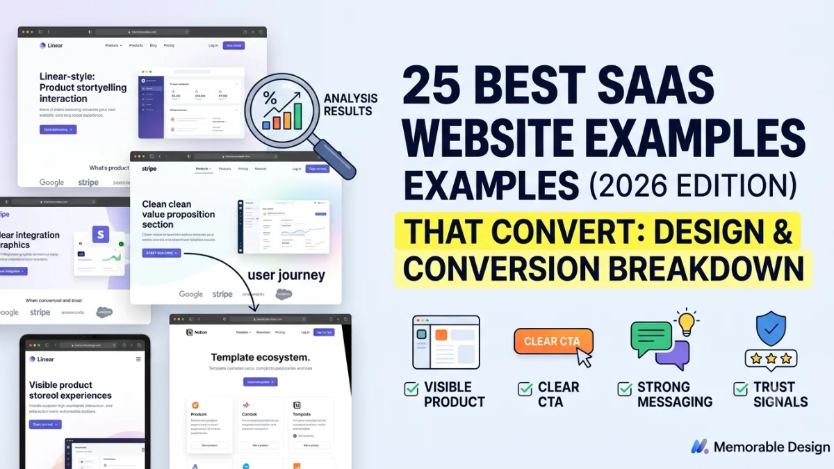
The best SaaS website examples combine a clear value proposition, visible product experience, credible social proof and one focused conversion path. Leading designs from Linear, Ramp, Stripe, Webflow and Notion show how strong messaging and usability turn website visitors into customers.
Memorabledesign reviewed leading software platforms to find the ultimate SaaS website examples. Many online galleries show pretty screenshots, but true web design inspiration requires deeper analysis. This guide evaluates real positioning, product presentation, trust signals, and conversion paths. We manually assessed each platform to ensure you get practical ideas for your own digital presence.
Key Takeaways
-
Clear positioning beats decorative complexity.
-
Product visuals reduce buyer uncertainty.
-
Social proof strengthens SaaS credibility.
-
One focused CTA improves conversion clarity.
How We Selected These SaaS Website Examples
We manually reviewed every software platform on this list using a strict evaluation framework. We analyzed value-proposition clarity, target-audience alignment, product demonstrations, brand differentiation, and social proof. Our team also assessed call-to-action visibility, information architecture, mobile usability, accessibility, and SEO-friendly page structures.
Note: All websites were actively reviewed and verified in July 2026.
SaaS Website Examples at a Glance
This comparison table highlights the core design strategies and conversion frameworks used by top-performing software platforms.
Best SaaS Website Examples Comparison
| SaaS Website | Category | Best Design Feature | Primary CTA | Funnel Model |
| Linear | Project management | Focused product storytelling | Start building | Product-led |
| Ramp | Fintech | Outcome-led messaging | Get started | Hybrid |
| Stripe | Payments | Product and developer clarity | Start now | Product-led |
| Webflow | Website platform | Visual product demonstration | Get started | Product-led |
| Notion | Productivity | Use-case segmentation | Get Notion free | Product-led |
| Vanta | Security | Trust and compliance messaging | Request demo | Sales-led |
| Clay | Sales intelligence | Distinctive brand experience | Start free | Hybrid |
| Slack | Collaboration | Simple benefit communication | Get started | Product-led |
25 Best SaaS Website Examples for 2026
Here is the breakdown:
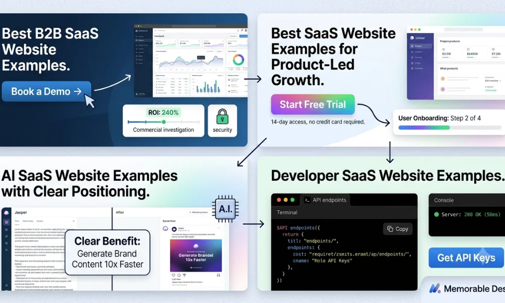
Best SaaS Website Examples for Product-Led Growth
1. Linear
-
Best for: Focused product storytelling.
-
Why it works: The homepage uses a minimal interface and concise product positioning to capture immediate attention. It relies on product-led visual storytelling and controlled animation.
-
What to copy: Show your software interface as the main visual asset on the page.
-
Potential limitation: The restrained copy style may not suit unfamiliar or complex business products.
2. Notion
-
Best for: Use-case segmentation.
-
Why it works: Notion provides audience-specific entry points and a highly flexible product demonstration. The page highlights a vast template ecosystem and a clear free-product CTA.
-
What to copy: Let different target audiences find a relevant use case quickly.
-
Potential limitation: The sheer volume of features can overwhelm a first-time visitor.
3. Slack
-
Best for: Simple benefit communication.
-
Why it works: It features instantly recognizable messaging alongside collaborative product imagery. The low-friction signup flow pairs well with prominent customer recognition logos.
-
What to copy: Explain the everyday user outcome before listing technical software features.
-
Potential limitation: Well-known brands can use less explanatory copy, which smaller startups cannot afford.
4. Loom
-
Best for: Demonstrating product simplicity.
-
Why it works: The design offers a clear product purpose and a real interface demonstration. Visitors see an immediate signup path that explains asynchronous video communication.
-
What to copy: Demonstrate how quickly users can reach their desired outcome.
-
Potential limitation: Video-heavy elements can slow down mobile loading speeds if unoptimized.
5. Calendly
-
Best for: A frictionless conversion path.
-
Why it works: The site leverages immediate problem recognition and a simple signup CTA box. It displays integration proof right next to role-based use cases.
-
What to copy: Remove unnecessary steps between understanding the software and trying it.
-
Potential limitation: The hyper-focused layout leaves little room for deep narrative storytelling.
Best B2B SaaS Website Examples
6. Ramp
-
Best for: Outcome-led messaging.
-
Why it works: Ramp focuses heavily on clear financial outcomes and strong customer proof. The layout breaks down individual product modules and offers distinct CTAs for different buyer stages.
-
What to copy: Lead with measurable business results instead of generic product claims.
-
Potential limitation: Multiple buyer paths can dilute the focus for smaller, single-product startups.
7. Vanta
-
Best for: Building enterprise trust.
-
Why it works: The interface highlights security and compliance entities through trust-centered navigation. Clean customer logos support a highly structured, demo-led sales funnel.
-
What to copy: Address security risk and credibility before asking for a sales conversation.
-
Potential limitation: A restrictive demo-only wall can deter smaller self-service buyers.
8. Gong
-
Best for: Category positioning.
-
Why it works: Gong uses strong, proprietary category language to capture revenue teams. The layout balances deep research insights with clear enterprise demonstration paths.
-
What to copy: Connect your software features directly with specific commercial revenue outcomes.
-
Potential limitation: High-energy corporate branding might alienate smaller, informal businesses.
9. HubSpot
-
Best for: A multi-product SaaS ecosystem.
-
Why it works: The complex product-suite navigation remains highly organized. It drives free-tool acquisition while organizing clear pathways for distinct target personas.
-
What to copy: Create clean hubs for visitors who have completely different awareness levels.
-
Potential limitation: The massive footprint makes navigation slow for users seeking one simple tool.
10. Apollo
-
Best for: Serving multiple buyer personas.
-
Why it works: The site handles sales-use-case segmentation beautifully with a free entry point. Deep feature breakdowns back up their trust and data positioning.
-
What to copy: Use tabbed interface elements to showcase distinct tools without clutter.
-
Potential limitation: Extensive product options can quickly increase the reader’s cognitive load.
AI SaaS Website Examples with Clear Positioning
11. Perplexity
-
Best for: Immediate product experience.
-
Why it works: The software application is available directly on the homepage. Minimal explanation is needed because visitors experience immediate value through a familiar search interaction.
-
What to copy: Allow visitors to experience your core value proposition as early as possible.
-
Potential limitation: Skipping a standard marketing explanation can confuse users who want background context.
12. Jasper
-
Best for: Enterprise AI positioning.
-
Why it works: Jasper focuses on marketing-specific use cases and robust brand governance tools. The site features corporate enterprise proof and a demo-oriented navigation flow.
-
What to copy: Replace vague AI industry claims with role-specific and workflow-specific benefits.
-
Potential limitation: A heavy enterprise focus can make the brand feel inaccessible to freelancers.
13. Copy.ai
-
Best for: Workflow-based messaging.
-
Why it works: The site positions itself around automated operational workflows for revenue teams. It provides concrete product examples that differentiate it from basic chat tools.
-
What to copy: Explicitly name the exact manual business processes your product improves.
-
Potential limitation: Highly technical workflow diagrams require close attention to remain readable.
14. Synthesia
-
Best for: Explaining a new product category.
-
Why it works: A video demonstration dominates the hero section alongside live AI-avatar examples. Visible customer logos back up the clear enterprise software use cases.
-
What to copy: Use the output of your product itself to explain an unfamiliar category.
-
Potential limitation: Video elements require fast hosting to prevent mobile performance drops.
15. Grammarly
-
Best for: Familiar AI product education.
-
Why it works: The site uses before-and-after communication examples that highlight broad relevance. A clear freemium CTA guides users to download specific browser extensions.
-
What to copy: Show a side-by-side comparison of life before and after using your software.
-
Potential limitation: Appealing to everyone can make the messaging feel slightly generic to enterprise buyers.
Developer SaaS Website Examples
16. Stripe
-
Best for: Combining marketing and documentation.
-
Why it works: Stripe blends developer-first credibility with a clean use-case architecture. Interactive design elements connect seamlessly with live technical documentation.
-
What to copy: Connect persuasive marketing arguments directly with practical implementation resources.
-
Potential limitation: The highly technical subtext can intimidate non-technical business decision-makers.
17. Vercel
-
Best for: Developer-focused product positioning.
-
Why it works: The copy targets technical audience clarity and the surrounding framework ecosystem. It leads with site performance messaging and an easy terminal-based entry path.
-
What to copy: Speak precisely to technical users without unnecessary simplification or corporate fluff.
-
Potential limitation: The complete absence of mainstream business jargon can alienate executive buyers.
18. Supabase
-
Best for: Open-source SaaS positioning.
-
Why it works: It uses explicit alternative positioning by framing itself against major industry giants. Code blocks and documentation links build immediate community trust.
-
What to copy: Boldly state what popular platform you replace to establish instant context.
-
Potential limitation: Dark mode aesthetics with bright code blocks do not always appeal to traditional corporate clients.
19. Clerk
-
Best for: Explaining a technical product clearly.
-
Why it works: Complex authentication workflows are explained through clear visual diagrams. Live code snippets sit right next to actual product screenshots.
-
What to copy: Pair abstract backend processes with concrete front-end user interface visuals.
-
Potential limitation: The hyper-specific focus means the site lacks broader business value messaging.
20. Sentry
-
Best for: Problem-led messaging.
-
Why it works: The copy establishes immediate pain-point recognition by showing broken code errors. It segments content by developer platform to speed up implementation.
-
What to copy: Show the exact problem your software solves within the first three seconds.
-
Potential limitation: The edgy, developer-centric humor might not resonate with traditional enterprise teams.
Fintech SaaS Website Examples
21. Brex
-
Best for: Premium financial positioning.
-
Why it works: Brex uses an enterprise-focused visual identity built on clean lines and deep colors. Corporate scale messaging joins forces with premium customer evidence.
-
What to copy: Use generous whitespace and high-contrast typography to project corporate security.
-
Potential limitation: The premium feel can discourage early-stage startups looking for free tools.
22. Mercury
-
Best for: Audience-specific branding.
-
Why it works: The design targets startup founders with custom typography and minimalist layout styles. A simple account-opening path sits next to highly curated founder content.
-
What to copy: Design your entire digital experience around the specific lifestyle of your core buyer.
-
Potential limitation: Niche branding makes it harder to expand into traditional, conservative industries later.
23. Paddle
-
Best for: Clarifying a complex business model.
-
Why it works: The site explains the merchant-of-record model using simple product diagrams. It speaks directly to software companies dealing with complex international tax compliance.
-
What to copy: Use structural step-by-step charts to explain complex financial or legal responsibilities.
-
Potential limitation: Heavy compliance copy can feel dry to creative software teams.
Creative SaaS Website Examples for Web Design Inspiration
24. Webflow
-
Best for: Visual product demonstration.
-
Why it works: The layout provides a stellar example of visual web design inspiration by showing the design canvas in action. Distinct enterprise and self-serve pathways guide different buyers.
-
What to copy: Let your product’s creative output serve as the background graphics of the site.
-
Potential limitation: The highly interactive canvas demo can overwhelm casual users who just want simple templates.
25. Framer
-
Best for: Interactive design storytelling.
-
Why it works: The site uses smooth motion and interaction to showcase its building capabilities. A massive template ecosystem appeals directly to modern digital designers.
-
What to copy: Use micro-interactions on scroll to prove the performance capabilities of your platform.
-
Potential limitation: Heavy visual movement must be managed carefully for performance and accessibility rules.
What the Best SaaS Landing Pages Have in Common
A complete website supports many distinct buyer journeys, but individual SaaS landing pages focus on one specific campaign or action. They eliminate distracting navigation options to keep the user moving toward a single goal.
High-Converting SaaS Landing-Page Elements
| Element | Purpose | Recommended Practice |
| Value Proposition | Establish relevance | State the audience, problem, and outcome clearly. |
| Product Visual | Reduce uncertainty | Show the actual interface, dashboard, or workflow. |
| Social Proof | Build credibility | Use recognizable customer logos and specific results. |
| Benefits | Explain value | Connect technical features directly with user outcomes. |
| Primary CTA | Direct action | Use one dominant action button throughout the page. |
| Risk Reversal | Reduce hesitation | Add a free trial, clear demo offer, or transparent pricing. |
| FAQ Section | Resolve objections | Answer critical pricing, security, and implementation questions. |
How to Apply These SaaS Website Examples to Your Own Site
Transforming inspiration into an actionable design strategy requires choosing the right framework for your specific business funnel.
Recommended Website Approach by SaaS Model
| SaaS Model | Homepage Priority | Recommended CTA | Essential Proof |
| Product-led | Product experience | Start free trial | Usage metrics and adoption rates |
| Sales-led | Business outcome | Book a demo | In-depth case studies and ROI |
| Hybrid | Segmented pathways | Start free or book demo | Verifiable customer growth results |
| Developer SaaS | Technical clarity | Start building | Documentation and community data |
| Enterprise SaaS | Trust and risk reduction | Contact sales | Security certifications and compliance |
Your Five-Step Implementation Process
-
Identify your primary buyer persona before touching any code.
-
Clarify one core, undeniable value promise in the hero section.
-
Show the real software product interface in action.
-
Prove your promise with clear, contextual customer evidence.
-
Create one dominant next action to guide the visitor forward.
Conclusion
The top SaaS website examples win customers through message clarity, product visibility, and intentional user journeys not just attractive graphics. Memorable Design helps businesses connect advanced SEO strategy, distinct brand identities, and conversion-focused UX to build high-performing digital platforms. Explore Memorable Design’s professional web design and SEO services today to elevate your software platform above the competition.
Frequently Asked Questions
What makes the best SaaS website examples effective?
They succeed by balancing message clarity, visible software interfaces, contextual proof, intuitive information architecture, and one focused conversion path.
Where can I find SaaS landing pages for inspiration?
You can study live software sites, curated design galleries, and direct competitor funnels. Focus on structural messaging instead of superficial visuals.
What should a SaaS homepage include?
Every homepage needs a clear value proposition, product demonstrations, core benefits, social proof, use-case segmentation, and objection-handling FAQs.
How are SaaS websites different from startup websites?
SaaS websites must communicate an ongoing software service, continuous subscription value, and immediate interactive onboarding paths rather than static company news.
